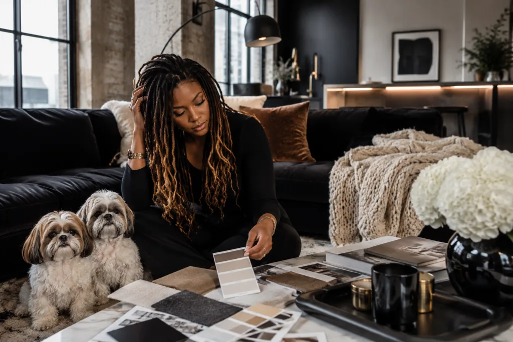
Hey friends heyy! 👋🏽 If you’ve ever stood in the middle of your room, holding a throw pillow like it’s the missing puzzle piece, wondering why the whole space still feels off, you’re in good company. Figuring out colors is where most people get stuck, even when everything technically “matches.”
The 60-30-10 rule is one of the most popular interior design color rules for a reason, it gives you a simple way to balance a room. But here’s the part no one talks about: if you follow it too literally, your home can still feel flat, forced, or not quite like you. Which is exactly why I want you to know, The Honest Truth About the 60-30-10 Rule in Interior Design.
The 60-30-10 Rule keeps popping up in every beginner guide in interior design. It’s one of those interior design rules people swear by when they’re trying to figure out how to decorate your home like an interior designer without overthinking every single choice.
At its core, the 60-30-10 rule is pretty straightforward: 60% of your room is your main color (usually walls or big furniture), 30% is your secondary color (think rugs, curtains, or accent chairs), and 10% is your pop-of-personality color (pillows, art, little decor pieces). It’s basically a visual balance trick that keeps things from feeling chaotic or flat. And honestly, as far as easy interior design tips for beginners that actually work go, this one earns its popularity. It gives you structure without boxing you in, which is exactly what most people need when they’re staring at paint swatches for way too long.
Now, does it actually work every single time? It does, but not perfectly, and that’s okay. Real homes aren’t showroom displays, and sometimes your favorite pieces don’t fall neatly into percentages. But the rule does give you a solid starting point, especially when your space feels “off” and you can’t quite explain why. It helps you edit, shift, and rebalance without starting from scratch. So no, it’s not magic, but it’s one of those interior design rules that quietly does its job in the background, making your space feel pulled together in a way that just makes sense.
What Exactly Is the 60-30-10 Rule in Interior Design?
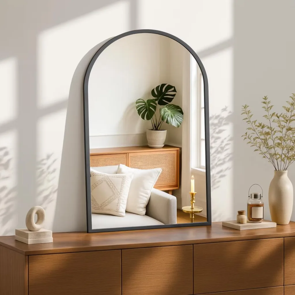
So what exactly is the 60-30-10 rule in interior design? In plain terms, it’s a way to divide your room’s colors so everything feels balanced without looking like you tried too hard. About 60% of the space is your dominant color, which usually shows up on your walls, larger furniture, or even your flooring. Then 30% is your secondary color, this is where you bring in contrast through things like rugs, curtains, or accent chairs. The final 10% is your accent color, and this is the fun part: pillows, artwork, decor pieces, the little details that give your space personality. If you’ve been deep in Interior design basics for beginners, this is one of those interior design rules that keeps coming up for a reason.
This approach didn’t just appear out of nowhere, it’s been around for decades because it taps into how we naturally respond to visual balance. Designers have leaned on it for years as a reliable way to keep rooms from feeling either overwhelming or flat. It’s less about strict math and more about proportion, which is why it still holds up even as trends change. When people are learning how to design your home like an interior designer, this rule tends to be one of the first “aha” moments because it simplifies what can feel like a million different decisions.
Visually, you can think of it as layers working together instead of competing. The 60% sets the tone, the 30% adds depth, and the 10% keeps things interesting without taking over the whole room. When those three parts are in sync, the space just feels right, even if you can’t immediately explain why. And that’s why it’s often included in easy interior design tips for beginners that actually work, because it gives you a clear path without making your space feel stiff or overly planned.
The Problem With the 60-30-10 Rule No One Talks About
The problem with the 60-30-10 rule in interior design is that it sounds simple until you’re standing in your actual home wondering why your living room still feels flat, busy, or just not you. On paper, choosing a dominant color, secondary color, and accent color makes perfect sense. But real homes have wood tones, mixed metals, patterned rugs, family pieces, natural light, and decor you already love, and none of that always fits neatly into a perfect decorating formula.
So if you’ve tried the 60-30-10 color rule and your space still feels off, take a breath: you’re not bad at decorating, and your home is not hopeless. The rule can absolutely help you create a more balanced home color palette, but only when you use it as a flexible guide instead of strict design math. Once you stop forcing every pillow, rug, curtain, and wall color into exact percentages, decorating starts to feel less stressful, and your space starts feeling more personal, pulled together, and peaceful.
When the 60-30-10 Rule Doesn’t Work
The 60-30-10 rule can fall flat when:
- Your colors are too similar, so the room feels bland.
- Your accent color takes over and becomes visually noisy.
- You ignore texture, pattern, wood tones, metal finishes, or natural materials.
- You’re decorating in a maximalist, eclectic, or bohemian style where strict percentages can flatten the personality.
- You treat the rule like math instead of a visual guide.
The goal is not to walk around your living room with a calculator. The goal is to give your eyes a little rhythm: one color leads, one color supports, and one color adds the wink.
The 60-30-10 Rule Explained: How to Use It to Decorate Any Room
The 60-30-10 rule in interior design is a simple way to choose colors for a room so everything feels balanced, pulled together, and easy on the eye. Instead of trying to make every color match perfectly, this rule gives each color a “job.” One color becomes the main color, one color supports it, and one color adds personality.
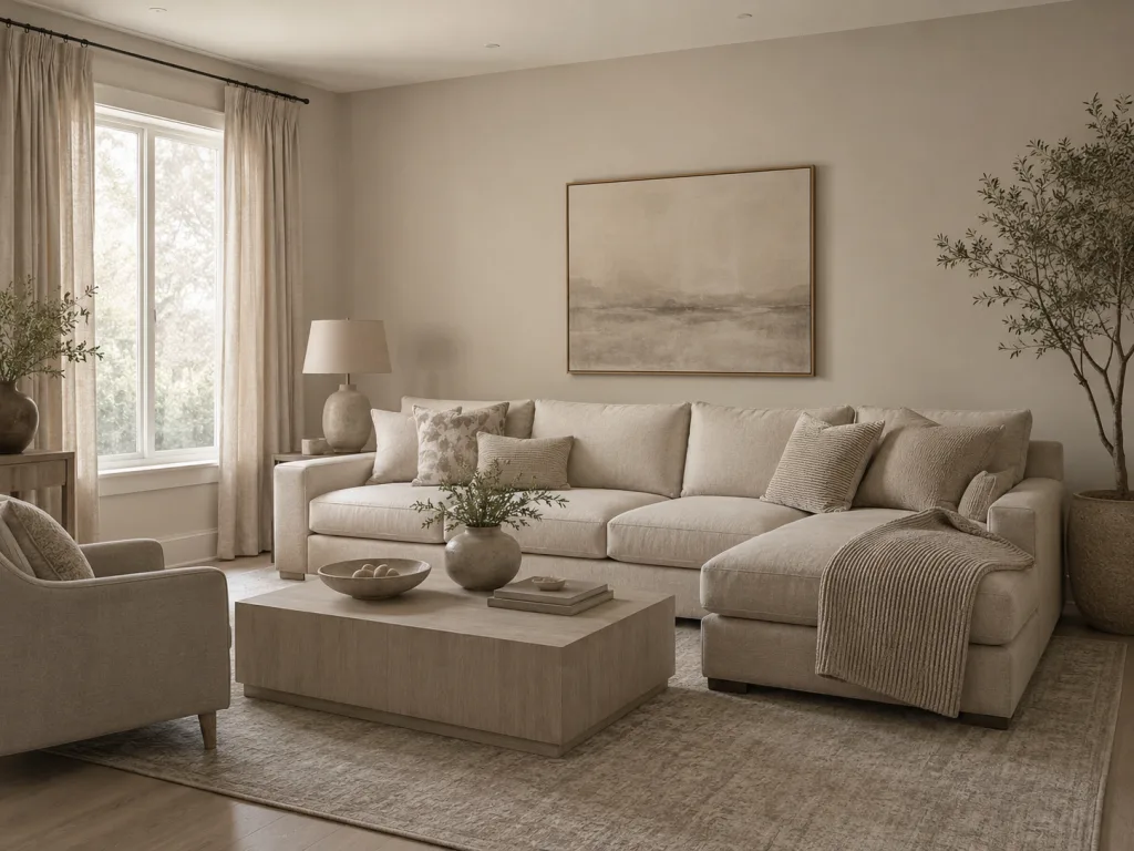
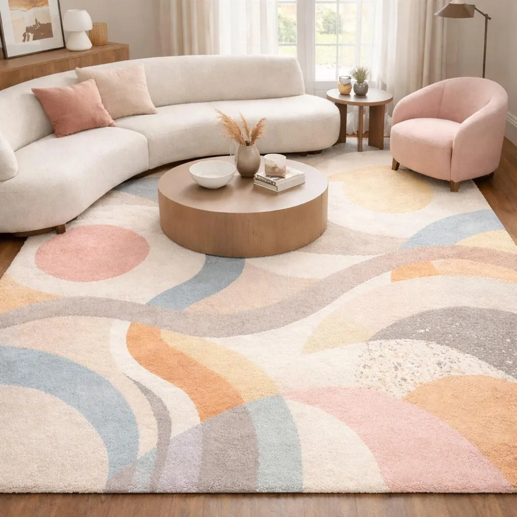
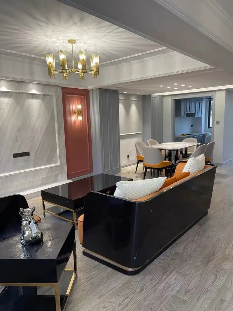
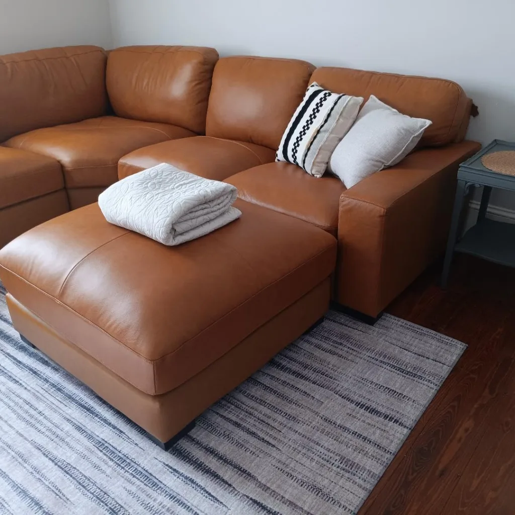
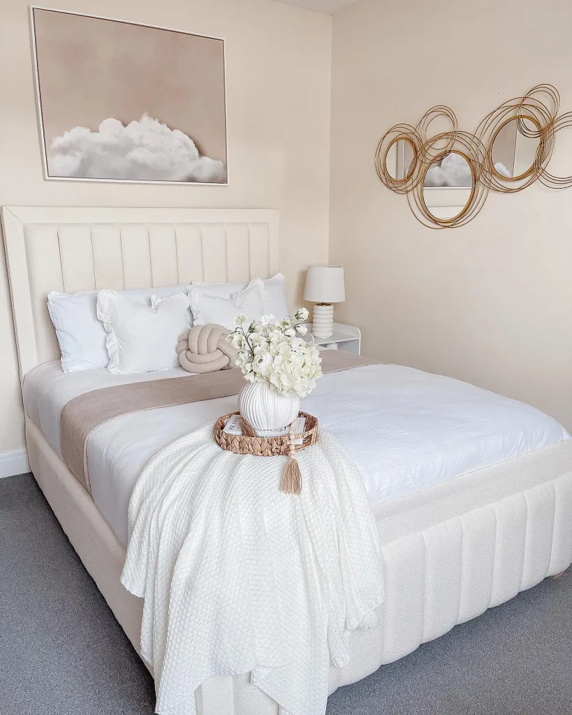
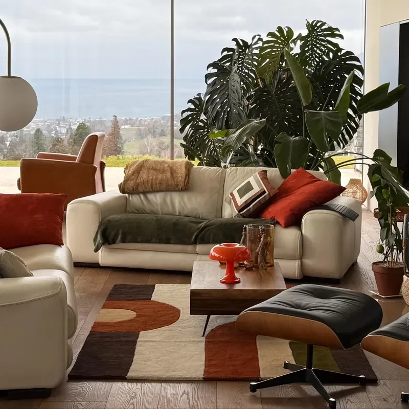
Here’s the easiest way to think about it: 60% of the room is your dominant color, 30% is your secondary color, and 10% is your accent color. Your dominant color is the color you see the most, usually on the walls, large sofa, bedding, cabinets, flooring, or big rug. Your secondary color shows up in supporting pieces like curtains, accent chairs, bedding, side tables, or a smaller rug. Your accent color is the fun little pop, the color you use in pillows, art, lamps, vases, candles, books, or decorative pieces.
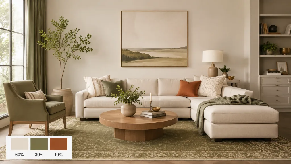
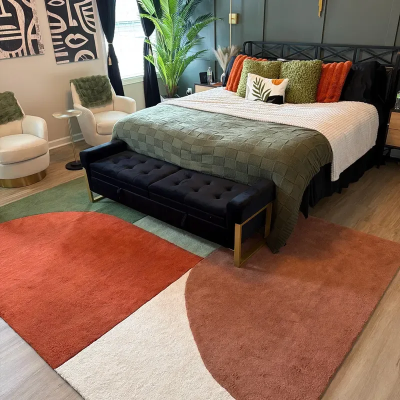
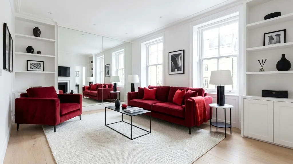
For example, let’s say you want a cozy, modern living room. Your 60% dominant color could be warm cream walls and a cream sofa. Your 30% secondary color could be olive green curtains, a rug, or an accent chair. Your 10% accent color could be gold, rust, or black in your pillows, picture frames, lamps, or coffee table decor. That’s the whole idea: the room has one main color, one supporting color, and one smaller color that makes it feel styled.
And no, you do not need to measure your room or do exact decorating math. The 60-30-10 color rule is more of a visual guide. If most of the room feels calm, one color adds depth, and a smaller color adds interest, you’re using the rule correctly. It helps you stop guessing, stop buying random cute pieces that do not work together, and start building a home color palette that actually makes sense.
| Percentage | Color Role | Where It Usually Shows Up |
|---|---|---|
| 60% | Dominant color | Walls, sofa, large rug, flooring, cabinetry |
| 30% | Secondary color | Curtains, chairs, bedding, side furniture |
| 10% | Accent color | Pillows, art, lamps, vases, decor |
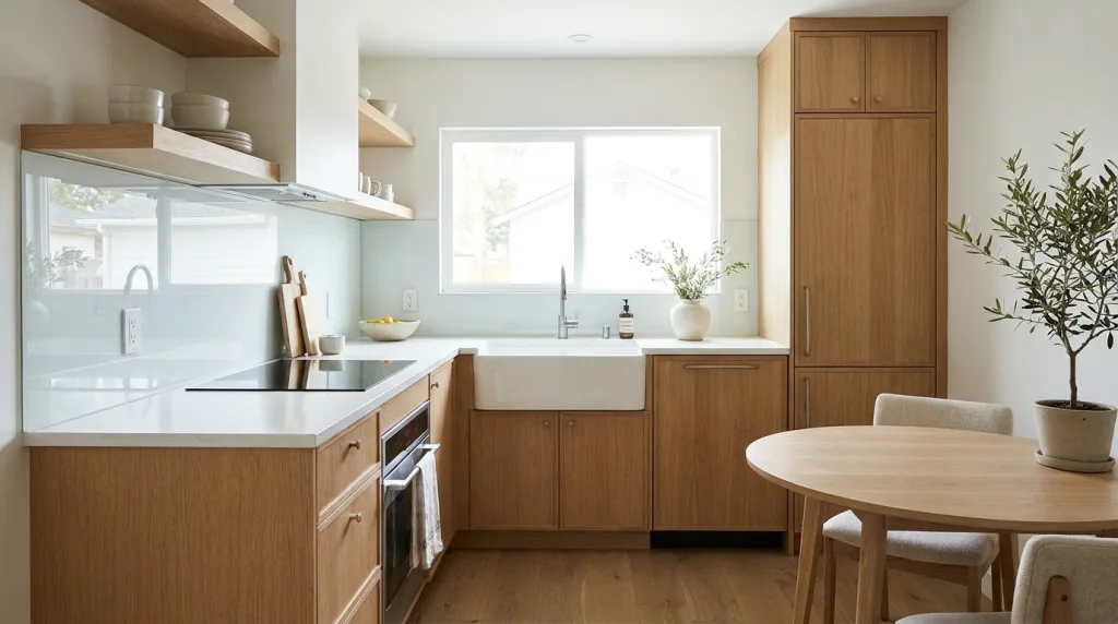
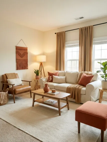
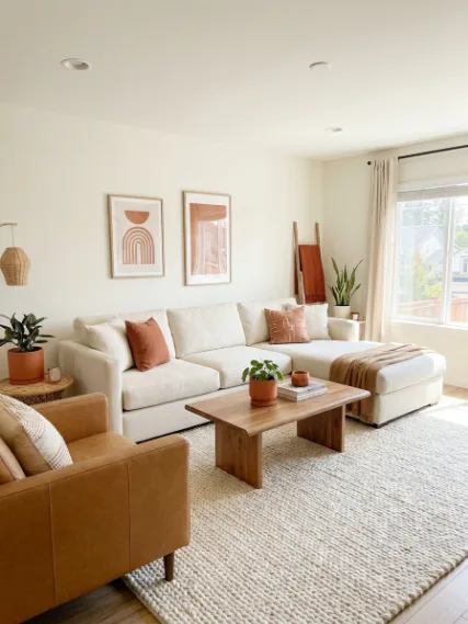
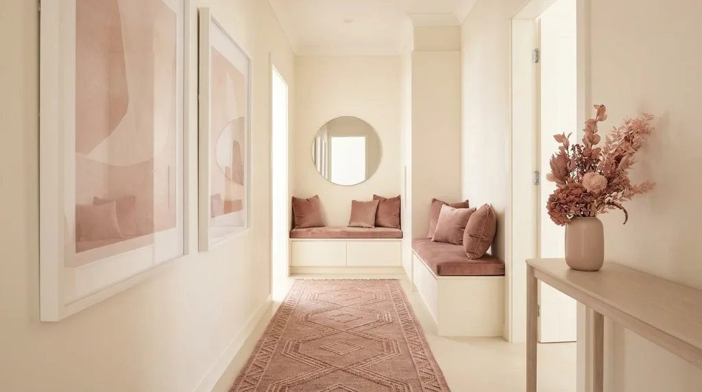
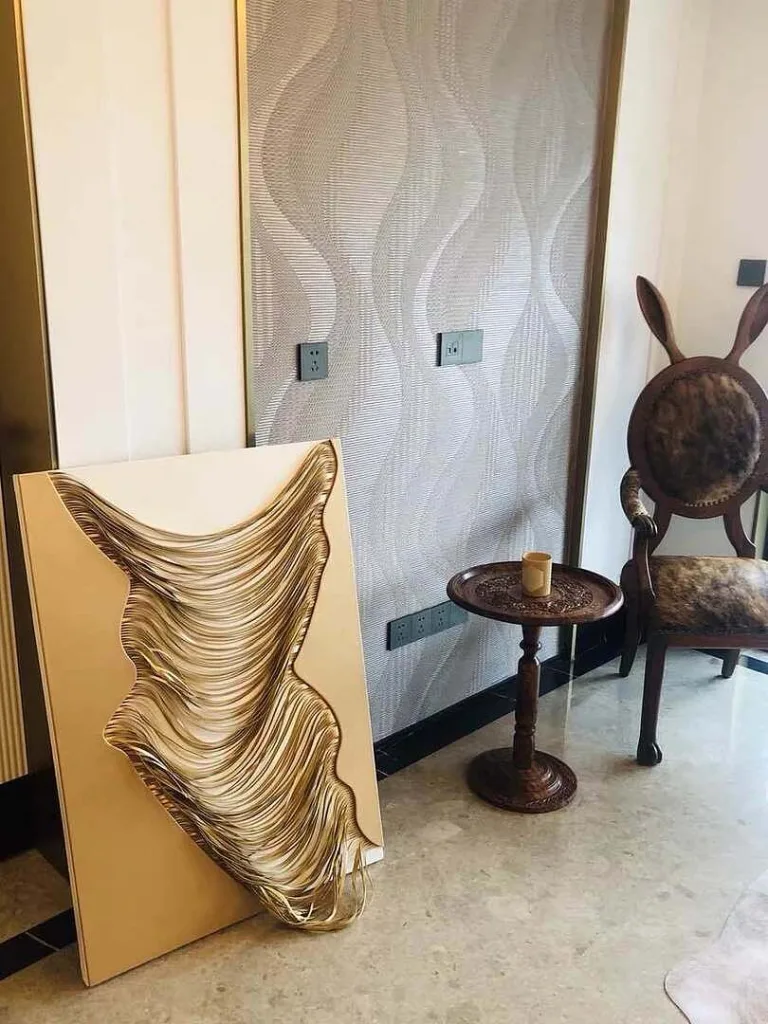
50 Shades of Beige (Photo Above) Friends, the issue is not that beige is bad. Beige can be beautiful. The problem is that the room has:
- No clear 30% secondary color
- No meaningful 10% accent color
- Very little contrast
- Too many similar tones competing quietly instead of creating balance
- Texture, but not enough color variation
When the 60-30-10 rule falls flat: This family room has plenty of pretty pieces, but the colors are too close together. Without a clear secondary color or intentional accent shade, the space feels flat, washed out, and unfinished instead of layered and pulled together.
This is what happens when your “60, 30, and 10” are basically cousins. The room is styled, but because every color sits in the same beige family, nothing really leads, supports, or pops.
That’s the teaching moment: the 60-30-10 rule does not work when the colors are technically different but visually too similar.
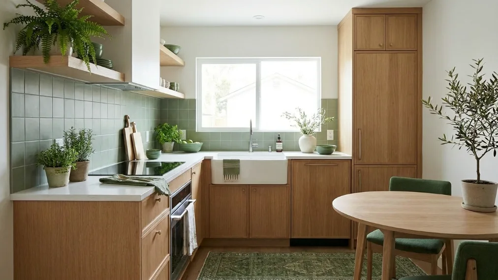
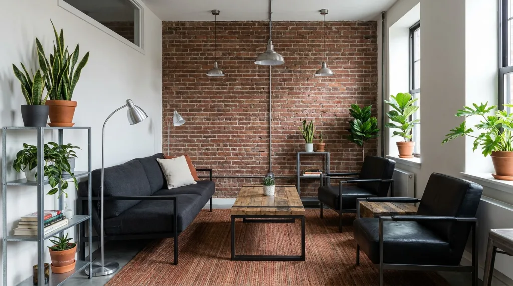
How the 60-30-10 Rule Works in a Real Room
This is where The Honest Truth About the 60-30-10 Rule in Interior Design starts to click, not just on paper or your imagination. When you actually apply it room by room, it becomes less about strict numbers and more about knowing what pieces carry the most visual weight.
In a living room, your sofa, walls, and maybe even a large rug usually take up that 60%, while chairs and curtains build out the 30%, and those little pops, pillows, art, coffee table decor, handle the 10%. In a bedroom, it shifts a bit: your bedding and walls often dominate, with nightstands and curtains supporting, and then your accents pulling everything together. Even in a kitchen, the same idea shows up through cabinetry, countertops, bar stools, and small styling pieces.
If you’ve been looking for practical interior design tips for beginners, this is one of those interior design rules that translates across every space without making things complicated.
- 60% (Dominant Color): This is your foundation. Think walls, large furniture like sofas or beds, and even big rugs that ground the space. This is what your eye sees first, so it sets the overall mood.
- 30% (Secondary Color): This layer adds contrast and keeps things from feeling one-note. Accent chairs, curtains, bedding, or even a painted furniture piece usually live here. It supports the main color without competing with it.
- 10% (Accent Color): This is where your personality shows up. Throw pillows, artwork, vases, books, and small decor accents all fall into this category. It’s a small percentage, but it’s what makes the room feel styled instead of just put together.
Once you start seeing your space in these layers, figuring out how to make your home look professionally decorated feels a whole lot less intimidating. It’s not about buying all new things, it’s about recognizing what role each piece already plays and adjusting from there. That’s why, in any beginner guide in interior design, this rule keeps showing up, it gives you just enough structure to make confident choices without overthinking every detail.
How to Choose Your 60-30-10 Color Palette From Scratch
Starting from scratch with color can feel like a lot, especially when you want your space to look pulled together and not like a random mix of “cute finds.” This is where 60-30-10 decorating rule really earns its spot in every interior design fundamentals for beginners.
Instead of guessing, you’re building a palette with intention, one color leads, one supports, and one adds that little spark. If you’re trying to figure out how to make your home look like an interior designer did it, this step is where things start to feel clear instead of chaotic.
| Step | What You’re Choosing | How to Get It Right |
|---|---|---|
| 60% | Dominant Color | Start with the mood you want. Soft neutrals (warm whites, beiges, greiges) feel calm and airy, while deeper tones (charcoal, navy, earthy browns) feel grounded and cozy. Look at your largest surfaces, walls, sofa, bed, and choose a color you won’t get tired of seeing every day. |
| 30% | Secondary Color | This one should complement your dominant color, not compete with it. If your base is light and warm, bring in a slightly deeper or cooler tone for contrast. Think rugs, curtains, or chairs that add dimension without stealing the spotlight. |
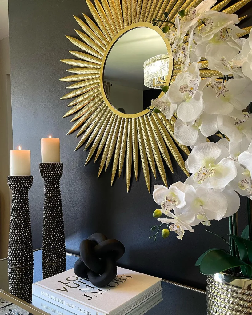
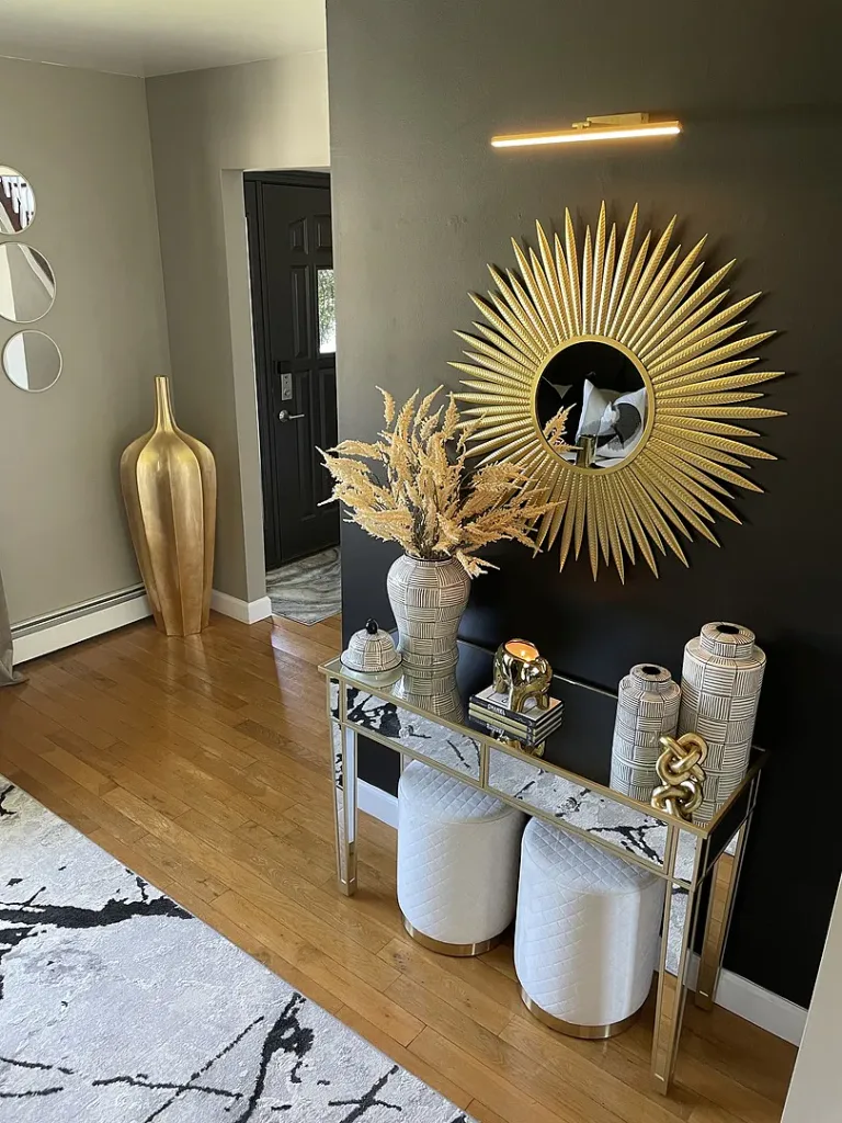
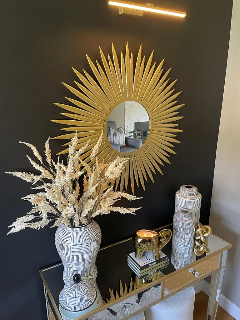
| 10% | Accent Color | This is your personality layer. Go bolder here, mustard, rust, emerald, even black or metallics. Use it in small doses through pillows, art, vases, and decor so it pops without overwhelming the room. |
If you’re stuck picking colors, you don’t have to do it all in your head. Tools like Coolors, Adobe Color, and Canva make it way easier to build palettes that already work together. That’s why this method keeps showing up in easy interior design tips for beginners that actually work. it gives you direction, but still leaves room to make the space feel like yours without second-guessing every choice.
Does the 60-30-10 Rule Actually Work for Every Room and Every Style?
Got a question like “does the 60-30-10 rule actually work for every room and every style?” Short answer: it works beautifully in some spaces and feels a little too neat in others. Where it really shines is in styles that already lean toward balance and structure. think traditional, transitional, coastal, or farmhouse interiors where calm layering is the whole vibe. In those spaces, the rule helps everything feel intentional without looking overdesigned.
But once you move into more expressive styles like maximalist, eclectic, or bohemian, it can start to feel a bit limiting. Those looks thrive on mixing, layering, and bending the rules, so trying to force everything into a clean 60-30-10 split can actually dull the personality you’re going for.
That’s why, in interior design color formula, the honest answer lands somewhere in the middle. It’s one of those interior design rules that gives you a strong starting point, especially if you’re following a easy interior design ideas for beginners and want clarity without the overwhelm. But it’s not a one-size-fits-all formula, and it doesn’t need to be followed perfectly to be useful. If anything, it works best when you treat it like a guide you can adjust, not a rule you’re scared to break.
When you’re figuring out how to style your home like a pro designer, the real skill isn’t sticking to exact percentages, it’s knowing when your space already feels balanced. The 60-30-10 rule helps you get there faster, especially if something feels off and you can’t quite pinpoint why. And that’s why it keeps showing up in beginner interior design tricks that actually work, it gives you confidence at the start, then steps out of the way once you’ve found your rhythm.
Common Mistakes People Make When Using the 60-30-10 Rule
The rule itself is simple, but the way people apply it? That’s where the chaos sneaks in. If you’ve been following a beginner guide in interior design and something still feels off, chances are one of these is the reason.
- Choosing colors that are too similar: If your 60, 30, and 10 are all living in the same tone family, the room ends up looking flat instead of layered. You want contrast, not a lineup of near-identical shades pretending to be different.
- Letting the 10% accent take over: That “little pop” is not supposed to become the main character. A few bold pillows? Cute. Ten bold pillows, matching art, and a loud rug? Now your accent color is competing with your dominant one.
- Forgetting textures and patterns count too: Color isn’t working alone. Your rug pattern, fabric textures, wood finishes, and even metallics all play into the balance. Ignoring that is why some rooms technically follow the rule but still feel unfinished.
- Not knowing how to fix it when it feels off: If the space feels dull, you probably need more contrast. If it feels busy, your accent color might be doing the most. Before buying anything new, try swapping, removing, or repositioning what you already have.
Once you spot these mistakes, figuring out how to decorate your home like an interior designer gets a whole lot easier. That’s why this rule keeps showing up in interior design tips for beginners that actually make a difference, it’s not about getting it perfect the first time, it’s about knowing how to adjust without starting from scratch.
Real Life 60-30-10 Color Palette Ideas You Can Try at Home
If you’re staring at your space thinking “okay… but what colors do I actually pick?” this is your shortcut. In 60-30-10 color rule, this is the part where things finally get fun, because you don’t have to guess anymore. These are ready-to-use palettes you can plug straight into your home, whether you’re following a simple interior design principles for newbies or just trying to figure out how to decorate like an interior designer on a budget without spiraling in the paint aisle.
- Neutral and warm, cream, camel, terracotta: Use cream as your 60% to keep things light and easy, layer in camel through furniture or textiles for that cozy 30%, then bring in terracotta as your 10% for warmth and a little earthy pop. This one always feels inviting without trying too hard.
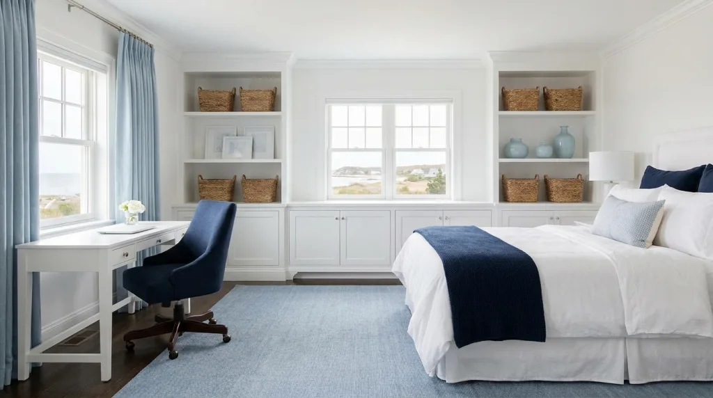
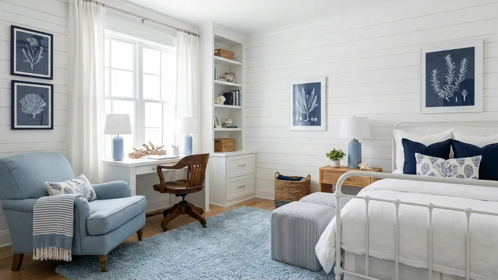
- Cool and coastal, white, soft blue, navy: White carries your 60% for that clean, airy base, soft blue fills the 30% to add a relaxed coastal feel, and navy steps in at 10% to ground the whole space. It’s calm, fresh, and quietly polished.
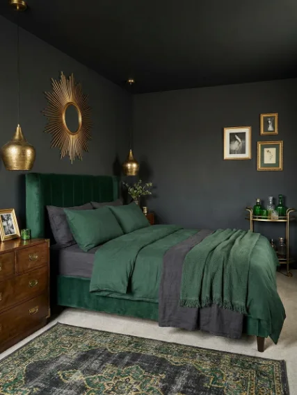
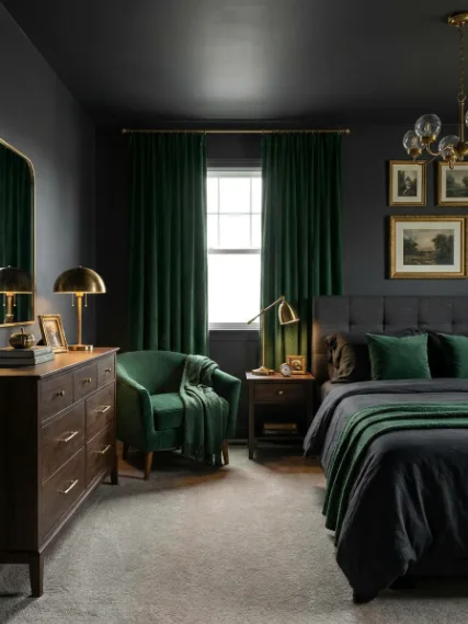
- Bold and moody, charcoal, forest green, gold: Charcoal sets a deep, dramatic 60%, forest green builds richness at 30%, and gold accents (think frames, lamps, hardware) hit that 10% with just enough shine. This one leans a little luxe without being over the top.
- Soft and romantic, blush, ivory, dusty rose: Ivory keeps the 60% soft and bright, blush adds warmth at 30%, and dusty rose finishes the look with a gentle 10% that feels layered, not overly sweet.
These combinations work because they already follow the balance built into those interior design rules, which is why they show up again and again in simple interior design tips for beginners that work. Once you try one, you’ll start seeing how easy it is to tweak the colors to fit your own style without losing that pulled-together look.
Is the 60-30-10 Rule Worth It? Here’s the Real Tea
After all that, here’s the honest verdict from What Is the 60-30-10 Rule, And Does It Actually Work?: it’s actually solid. Not perfect, not foolproof, but genuinely helpful. It gives you a clear starting point when your brain is tired of second-guessing every color choice, especially if you’ve been digging through a beginner guide in interior design trying to make sense of it all. The trick is not treating it like a strict formula you can’t break. The magic really happens when you use it as a guide, then adjust based on what your space needs. That’s how you start to figure out how to decorate your home like an interior designer, less rule-following, more knowing when something feels right.
If you’re trying this out, don’t redo your whole house in one weekend. Pick one room, your living room, your bedroom, even a small corner, and test it there. Play with your 60, shift your 30, swap out your 10, and watch how the space changes without you having to buy everything new. That’s why this keeps landing on lists of easy interior design tips for beginners that actually work, it’s approachable, flexible, and it actually teaches you something about your own style along the way.
And hey friends, I want to see what y’all come up with. Share your 60-30-10 color palette attempts, your before-and-afters, or even the ones you’re not sure about, send them over on Instagram, Pinterest, or TikTok, or drop your questions so we can figure it out together.
If you’re more of a visual learner, I’ve got more contents waiting for you on YouTube too. And once you’ve locked in your colors, you already know, you can shop pieces that fit your palette over at CuratedbyLani.com and pull your whole space together without the guesswork.

![]()