Your Guide to the Colore Palette 2026 and Stylish Interiors
Hey y’all, can you believe we’re already this close to saying goodbye to another year? New 2026 Color Trends For Stylish Interiors are officially knocking on the door, and if you’re anything like me, you’re already side-eyeing your walls like, “Yeah… your time is almost up.”
As 2026 creeps in, interior design lovers everywhere are itching for a refresh, and let’s be real, color is always the first thing to change. It’s the fastest glow-up, the biggest mood shifter, and the easiest way to make your home feel brand new without tearing down a single wall.
Now let’s talk about the elephant in the room: Pantone’s Cloud Dancer. Whew. When that color dropped, the internet had opinions. Some folks loved its calm, airy vibe, while others felt it was a little too safe, a little too “that’s it?” And honestly, that debate says a lot about where interior design trends 2026 are headed. People aren’t settling for boring anymore. They want color that feels intentional, emotional, and full of personality, not just something that fades politely into the background.
And if a color can’t make you feel something, it’s probably not making the cut. We’re officially in our “main character interiors” era, where homes are meant to reflect mood, confidence, and a little creative risk. Translation? Soft neutrals still have a place, but they better come with texture, contrast, or a bold accent friend to keep things interesting.
Interior design in 2026 is shaping up to be expressive, cozy, and a lot more personal. After years of cool neutrals and minimalist everything, homeowners are leaning into richer tones, nature-inspired shades, and warmer neutrals that actually feel lived-in.
The 2026 interior design color trends are all about balance, pairing bold hues with comforting bases, building a color palette 2026 that feels fresh but still timeless. And don’t worry, we’ll break it all down with real interior design tips and tricks you can actually use, no design degree required.
The 2026 Interior Design Color Trends
Let’s take a quick pit stop before we jump headfirst into the colors of the year. New 2026 Color Trends For Stylish Interiors aren’t just about picking pretty shade, they’re about mood, personality, and giving your space some serious attitude (the good kind).
2026 interior design color trends are shaking things up. We’re talking richer earth tones that hug you like your favorite blanket, nature-inspired hues that make your home feel alive, and neutrals that aren’t basic, they have depth, character, and a little sass. This isn’t just about painting walls; it’s about creating a vibe that actually feels like home.
And don’t worry, I’ve got your back with practical interior design tips and tricks for using these shades in a way that works. By the end, you’ll be ready to mix, match, and layer your color palette 2026 like a pro, without turning your home into a Pinterest fail. Buckle up, because the best colors of 2026 are just around the corner.
The Cloud Dancer Conversation: Why “Just White” Isn’t Enough Anymore

Let’s dive into one of the buzziest topics in New 2026 Color Trends For Stylish Interiors: Pantone’s Cloud Dancer, to be specific, PANTONE 11-4201 Cloud Dancer. When this soft, airy white hit the scene, it had people talking, some were swooning over its calm, peaceful vibe, like a breath of fresh Houston morning air. Others, though? They raised an eyebrow, calling it predictable, “just white’ or “too safe” for a year that’s all about personality and mood.

But here’s the thing, 2026 isn’t turning its back on neutrals. Not at all. It’s asking for more depth, warmth, and emotion in every corner of your home. White doesn’t have to be plain or boring (I promise). The trick is layering it with textures, warm undertones, and complementary shades.

For example, pair a Cloud Dancer wall with natural wood accents, rich velvet fabrics, or a pop of earthy terracotta in your accessories. That’s how you take a “safe” base and turn it into something full of character.

Some tips to make neutrals feel alive: mix finishes like matte and glossy, throw in patterned textiles, or add subtle accent colors from your color palette 2026. What to avoid? Flat, one-note whites with zero personality , it can feel cold and uninspired.

By embracing these small tweaks, you’re not rejecting the calm of neutrals; you’re giving them soul. And that, my friends, is exactly what interior design trends 2026 are all about, balancing serenity with statement, comfort with emotion, and making your space unmistakably yours.

This approach also makes your space totally Instagram-worthy without trying too hard, and it’s the kind of insider interior design tips and tricks that’ll have your friends asking, “Where did you get this vibe?”
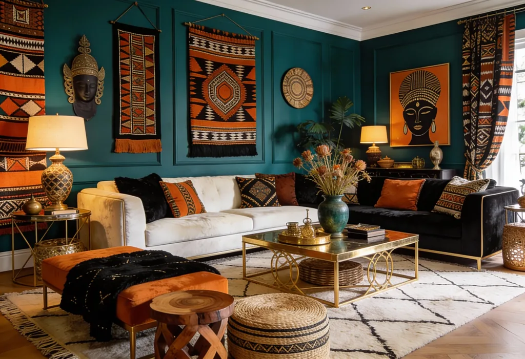
Transformative Teal: The Oceanic Green Everyone’s Talking About
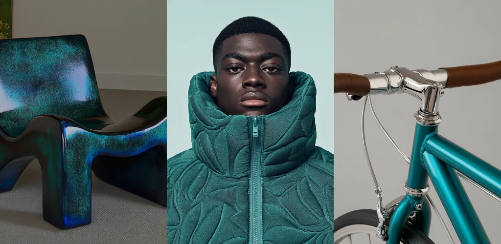
Alright friends, after the Cloud Dancer debate, let’s bring in a color that’s making a serious splash: Transformative Teal. If you weren’t convinced by the Pantone white (and let’s be real, a lot of people weren’t), this is your new best friend. New 2026 Color Trends For Stylish Interiors are leaning into hues that are bold, expressive, and full of life, and this teal hits all those marks.

WGSN and Coloro are calling it the Color of the Year for 2026, and for good reason. 2026 interior design trends are showing a shift toward sustainability, ecological responsibility, and a forward-looking mindset, and Transformative Teal perfectly reflects that.

It’s a fluid fusion of blue and aquatic green that captures the diversity of nature and taps into an Earth-first vibe. More than just a pretty shade, it represents change, redirection, and even a little resilience for those tricky climate-conscious moods.

If you’re into Feng Shui (or just want a little extra luck), this oceanic green plays nicely alongside red, gold, and even the very white some people weren’t feeling. It’s a lucky, grounding, and surprisingly versatile shade.

Tips for using Transformative Teal in your home? Pair it with warm woods or soft neutrals to balance its boldness, add gold or brass accents for a touch of glam, or layer in patterned textiles for depth.

Want a pop without commitment? Teal throw pillows, a statement rug, or even a small accent wall will make your space feel fresh and modern without going overboard.

So if your color palette 2026 was feeling a little safe, this shade is your permission slip to get creative. With the right approach, Transformative Teal can make any room feel intentional, calming, and just a little bit magical, and yes, interior design tips and tricks are included so you don’t have to guess.
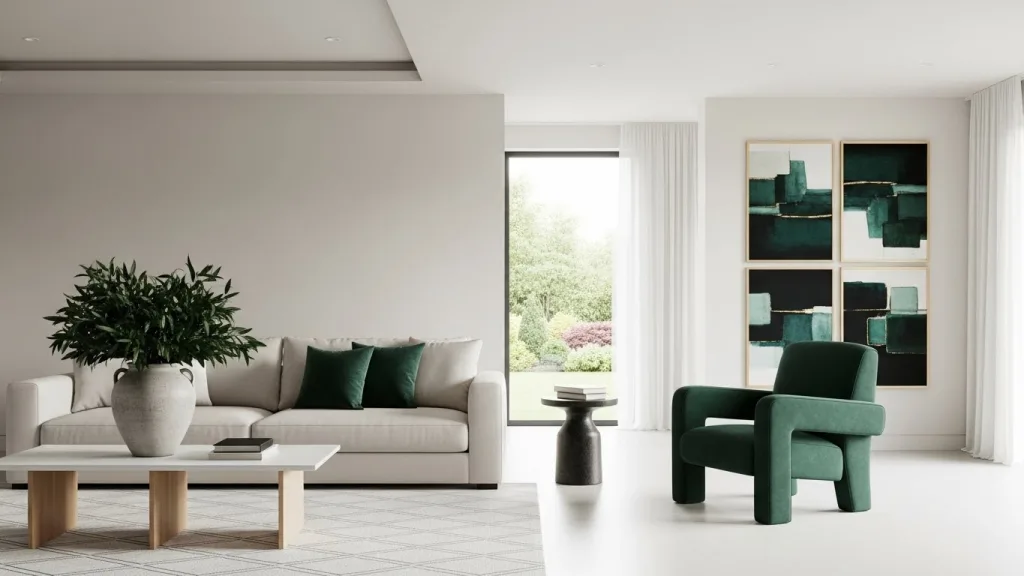
Elevated Neutrals: The Beyond Basic White

Let’s take a moment to appreciate the staying power of neutrals. New 2026 Color Trends For Stylish Interiors aren’t about ditching what works , sometimes the classics just need a little glow-up. Cream, warm greige, soft oat, and sandy tones are still the crowd favorites, and honestly, we’re here for it.

So why are designers layering neutrals instead of just slapping on flat white? Because life (and interiors) is all about depth, texture, and personality. Layering soft neutrals adds warmth, dimension, and that “lived-in but luxe” feeling. It prevents rooms from looking like sterile Pinterest boards and gives your home a cozy, inviting vibe without going overboard.


Where do these elevated neutrals shine the most? Living rooms, open layouts, and rentals, basically spaces where you want a soothing base that can play nice with bolder accents. Pro tip: mix finishes like matte walls with glossy trims, toss in textured fabrics, or add natural wood elements.

This is where your color palette 2026 comes alive, giving you all the style points without the stress. And yes, these are the kind of interior design tips and tricks that actually make your home feel intentional, stylish, and oh-so-Houston chic.

If you thought neutrals were just beige and boring, Sherwin-Williams is here to prove you wrong. Their 2026 Color of the Year, Universal Khaki (SW 6150), is a warm, mid-tone neutral that feels like it was made for cozy, intentional spaces. Inspired by nature, lasting materials, and simple luxury, this khaki isn’t flat or basic, it’s approachable, versatile, and the perfect bridge between the deep earthy browns we love and lighter neutrals like oat and cream.

Universal Khaki fits beautifully into a broader 2026 trend toward warm, layered neutrals, moving away from the cool grays of the past. Paired with deeper shades like Relic Bronze or balanced with classic whites, it creates a color palette 2026 that feels timeless, functional, and full of character.

It’s ideal for living rooms, open layouts, or anywhere you want that “cozy but chic” vibe. Layer it with textured fabrics, wood accents, or even subtle pops of jewel tones, and suddenly your space feels curated, intentional, and very much in line with interior design trends 2026, all without trying too hard.
Earthy Neutrals and Browns: Ground Your Space in Style

Then here we are and still one of the most reliable favorites in New 2026 Color Trends For Stylish Interiors: earthy neutrals and browns. These shades aren’t just accents anymore, we’re talking deep chocolates, sandy beiges, taupes, and rich espresso tones taking center stage. They’re sophisticated, grounding, and totally capable of carrying a whole room without feeling heavy or dull.

Notice a pattern yet? A lot of the 2026 interior design color trends are leaning into earthy, natural vibes. It’s like designers finally said, “Yes, let’s bring the ecosystem indoors.” From grounding your living room to adding warmth to open layouts, these tones give a space a cozy, intentional feel while still staying modern.

Tips for working with earthy browns? Layer different shades together for depth, mix in natural textures like wood and linen, and balance with lighter neutrals to avoid a space that feels too dark. With this approach, your color palette 2026 will feel harmonious, inviting, and full of character. And of course, these are the kind of interior design tips and tricks that make your home feel like it was styled by someone who actually gets it.
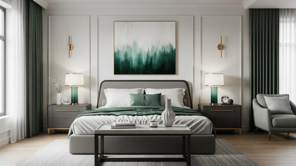
Etsy’s Patina Blue: The Color That Ages Like Fine Copper

Alright y’all, after all the chatter about whites, neutrals, and browns, Etsy swoops in with a color that’s basically the cool, artsy cousin of all those safe shades. Their 2026 Color of the Year? Patina Blue, a moody, blue-green inspired by the way copper ages over time. It’s the kind of color that feels lived-in, soulful, and a little mysterious, like that vintage jacket you can’t stop wearing.

Here’s the kicker: Etsy didn’t just pick this color out of a hat. They leaned on search data, cultural vibes, and the people themselves. In fact, 67% of Etsy shoppers voted for Patina Blue in a social media poll. Searches for “blue copper” have tripled in the past year, proving that we all secretly love colors with personality, history, and a hint of drama.

Patina Blue taps into the 2026 interior design color trends by celebrating things that age gracefully. It’s versatile enough to live on your walls, textiles, or decor pieces, but it also pairs like a dream with warm metals, wood accents, and cozy textures. Basically, it’s like your space just got a personality upgrade without you breaking a sweat.

Interior Design Tips & Tricks for Patina Blue:
- Dip your toes first: Pillows, ceramics, or small décor pieces let you play with the trend without committing to a whole room.
- Make a statement: An accent wall or bold furniture piece in Patina Blue instantly adds character and soul.
- Warm it up: Copper, brass, or warm woods make the color feel cozy, not chilly.
- Mix with nature: Linen, rattan, and natural textures make this hue feel grounded and intentional.

Patina Blue brings just the right mix of calm, depth, and drama to your color palette 2026. It’s perfect for anyone wanting their space to feel stylish, layered, and totally you, basically the kind of interior design tips and tricks that’ll have your friends asking, “Where did you even get this vibe?”
How to Use 2026 Color Trends Without Repainting Everything

I know, not everyone wants to grab a paint roller and commit to a full-on makeover (that’s me), but good news: New 2026 Color Trends For Stylish Interiors don’t require living in a construction zone to make an impact. There are plenty of clever ways to ride the color wave without repainting every wall.

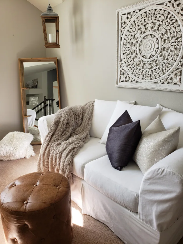
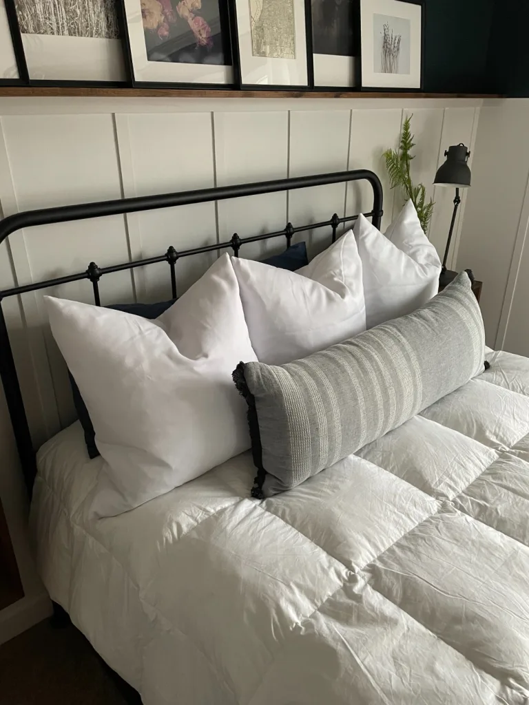
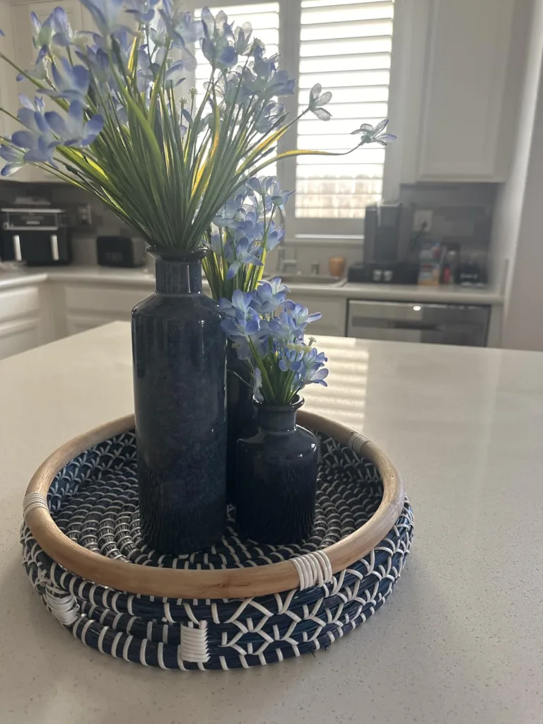
Pillows and home accents are the easiest, lowest-commitment way to refresh your space while still feeling intentional and elevated. Think rich jewel tones, warm earth hues, and soft layered neutrals showing up through throw pillows, textured blankets, ceramic vases, and sculptural decor pieces you can swap out seasonally or whenever your mood changes.

What I love most about updating with pillows and accents is the instant transformation factor. A neutral sofa becomes a statement with a few velvet or embroidered pillows in trending shades, while a simple tray, lamp, or bowl in a fresh color can quietly modernize a room. This approach lets you experiment with bold colors or subtle tones without the long-term commitment (or cleanup) of paint. It’s budget-friendly, renter-approved, and perfectly aligned with the Lani Does It philosophy: stylish homes should feel flexible, livable, and easy to evolve, no hard hats required.
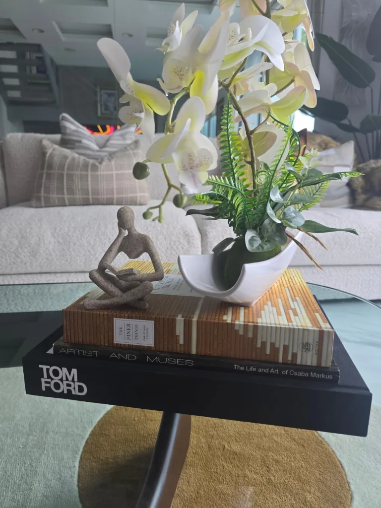
Art is another secret weapon: a statement canvas or gallery wall can bring in rich earthy neutrals, jewel tones, or oceanic blues to instantly refresh a room.

Lighting can elevate your 2026 interior design color trends. Warm-toned bulbs, colored glass lamps, or reflective metallic accents make neutrals feel richer and teals and blues pop just right. Smaller accent pieces like vases, trays, or coffee table books add trendy pops of color and texture, totally Pinterest-approved and low-commitment.

These tricks are perfect for renters and budget-conscious homes. A little layering here, a pop of color there, and the space instantly feels curated, stylish, and Instagram-worthy, all while staying stress-free. These are the kind of interior design tips and tricks that make a home feel intentional, playful, and completely 2026-ready.

If you’re loving these color swaps and accent ideas but want to go a step deeper, check out my other blog: Design Your Mood Happy: How Color Affects Your Mind. It’s all about how the shades in your home can influence energy, mood, and even productivity. From calming neutrals to mood-boosting blues and playful jewel tones, understanding how color affects your mind can help you make smarter choices with your 2026 interior design color trends, and build a space that doesn’t just look good, but feels amazing too.
Make 2026 Colors Truly Yours

New 2026 Color Trends For Stylish Interiors are here, and the buzz is real. From earthy neutrals to bold teals and Patina Blue, the color palette 2026 is packed with personality, mood, and plenty of Instagram-ready vibes. Following these interior design trends 2026 is a great way to stay inspired, freshen up a space, and explore new ways to layer color, texture, and lighting. Plus, the tips and tricks shared here make it easy to experiment without repainting every wall or breaking the bank.

Here’s a little truth I’ve noticed, color trends usually start with big groups, brands, or forecasting companies. They set the stage, and everyone else often jumps on board. Lately, though, more people are embracing what I like to call the “anti-trend.” And I highly encourage it.
Your home doesn’t need to follow fleeting fashion just because someone said so. The real joy comes from selecting colors that reflect your personality, your comfort, and your lifestyle. That’s the approach that makes your color palette 2026 feel personal, intentional, and uniquely yours.

Layer earthy browns, try out Transformative Teal, or sprinkle in a few Patina Blue accent, these interior design tips and tricks are here to guide you, not dictate your choices. Play, mix, and match until your space tells your story. Trends come and go, but a home that feels like you? That’s timeless.
If you loved playing with these 2026 color trends, you can catch even more ideas, tips, and inspiration over on my Pinterest, TikTok, Instagram, and YouTube. I’m always sharing little ways to make your space feel intentional, fun, and totally you.

Want more inspo and tips for for evergreen home decor? Follow me on Pinterest, Instagram, TikTok, and YouTube.
And for anyone who loves curated finds and pieces that actually elevate a room, check out my shop, CuratedbyLani. It’s full of handpicked items that work perfectly with these color palettes and your personal style, kind of like your home’s new BFF.

![]()