Hey y’all! Fall decorating often gets reduced to orange pumpkins and yellow leaves, as if autumn received a two-color dress code and nobody questioned it. How Designers Pick Fall Colors That Always Look Stunning takes a wider view.
Designers study the whole room before adding a seasonal shade, including permanent finishes, undertones, daylight, lamp light, color proportion, and the material carrying the color. That sounds technical, but the process begins with something very ordinary: looking closely at what you already own.
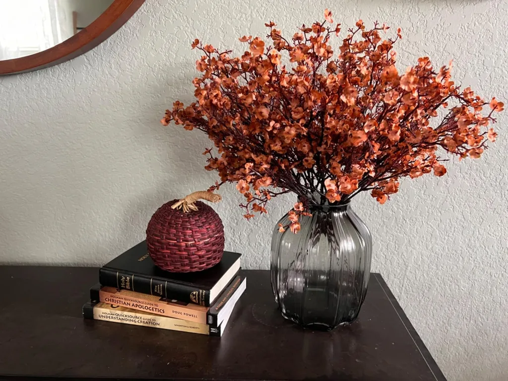
There is no universal perfect fall color palette. A rich rust may look wonderful beside warm oak and strangely loud beside blue-gray flooring. The right choice depends on the walls, sofa, rug, stone, wood, and light already in the room. Good autumn decorating colors cooperate with those features instead of arriving like houseguests who brought six suitcases and rearranged the furniture before dinner.
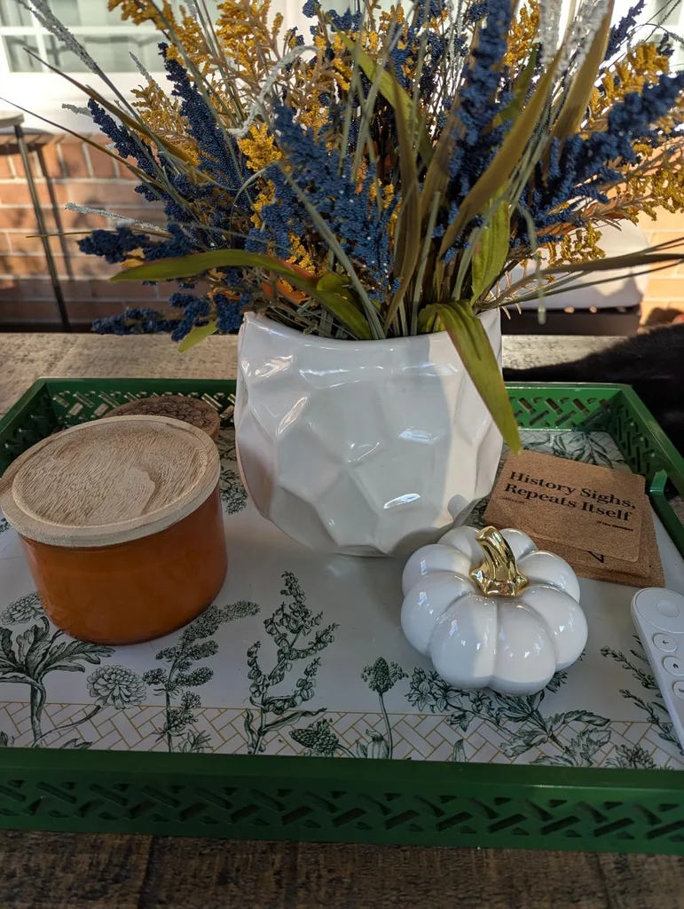
This guide turns professional color thinking into a process you can use with fabric scraps, paint chips, pillow covers, books, pottery, and other pieces already at home. You will learn how to choose fall colors by reading undertones, watching light, assigning each shade a job, and testing the combination before spending money. Fall colors for home decor should feel seasonal, but the room should still recognize itself when you walk in.
Designers Start With the Colors Already in the Room
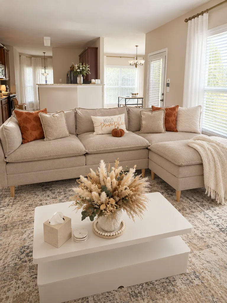
Designers rarely choose fall colors for home decor in isolation. They begin with the fixed or expensive pieces: flooring, countertops, cabinets, fireplace stone or brick, large rugs, sofas, window treatments, and wood finishes. Those materials already occupy most of the visual space, so they form the foundation of the interior fall color palette. Benjamin Moore similarly advises using hard surfaces such as tile, brick, marble, and flooring to guide color selection, then pulling related hues from rugs, curtains, artwork, and other furnishings.
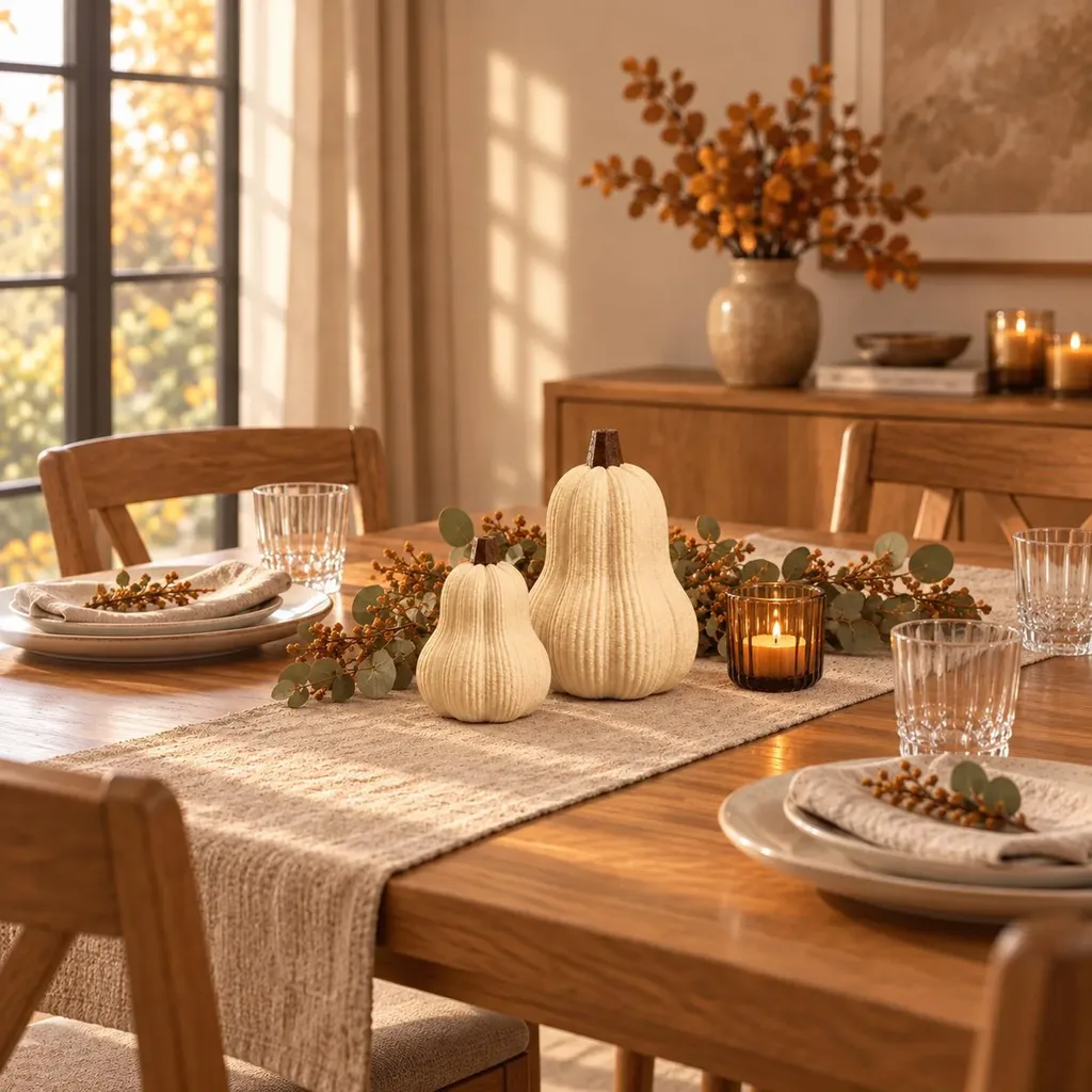
Try this before buying anything: stand in the doorway and take a photograph of the room, then identify the three colors covering the most space. Warm oak can support olive, rust, chocolate, and cream. Cool gray flooring may work more naturally with plum, navy, dusty rose, or blue-green. Red brick can welcome burgundy, tobacco brown, muted green, and warm ivory, while white or cream furniture leaves more room for a deep accent. These fall decorating color ideas begin with observation, not a shopping cart.
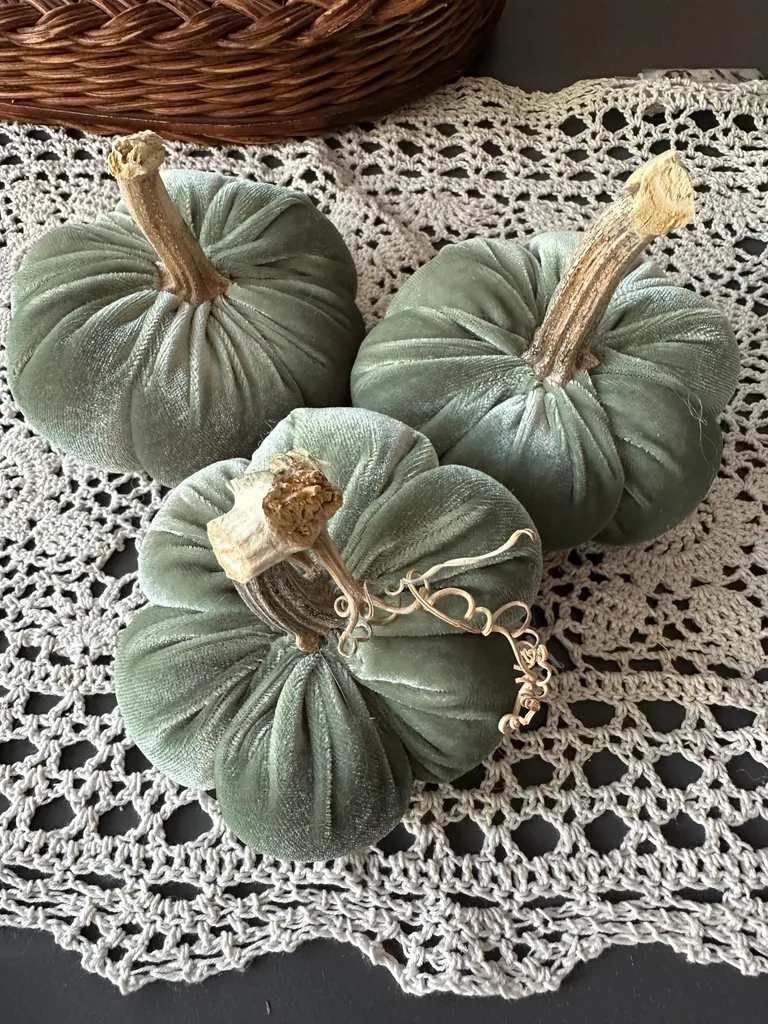
Permanent finishes do not have to match every seasonal accessory, but coordinating fall colors should acknowledge them. If the sofa leans pink-beige, a yellow-brown pillow may look oddly separate even though both tags call the colors neutral. Use the photograph to spot the room’s visual leaders, then choose seasonal shades that join the conversation. The floor and sofa have seniority here. They are not moving because one charming pumpkin pillow showed up in August.
How Designers Match Fall Colors by Undertone
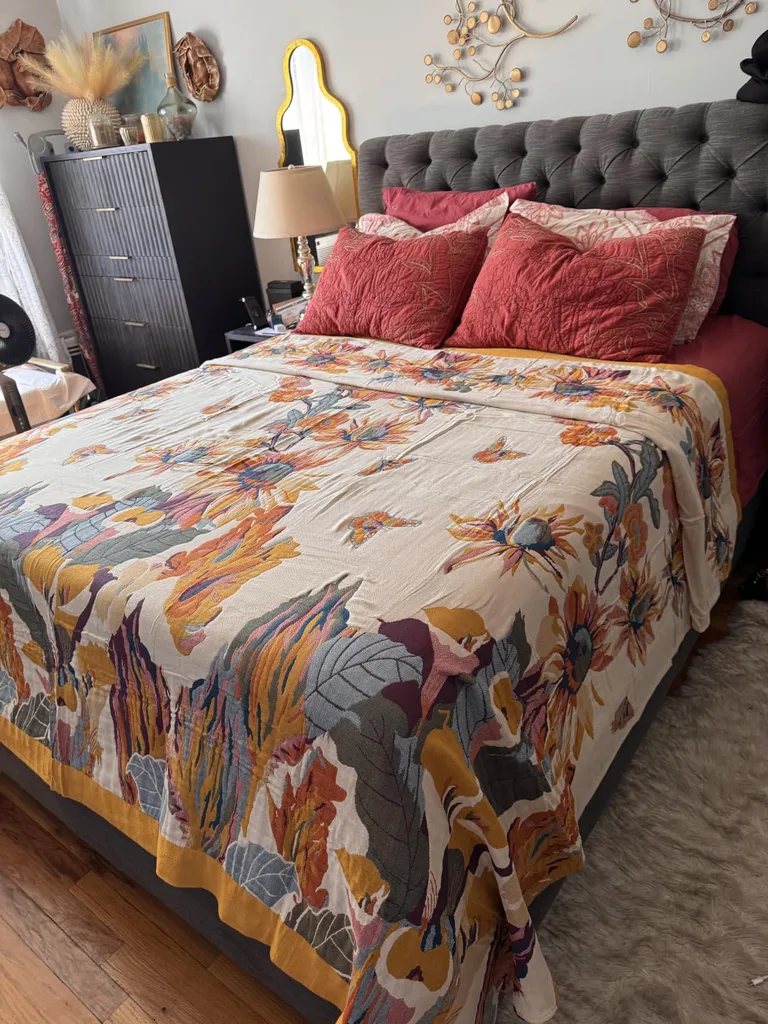
A color has a mass tone, the main color you notice first, and an undertone, the quieter hue underneath. Sherwin-Williams explains that the undertone is what distinguishes one color from similar options, and comparing chips side by side makes it easier to see. This matters because two shades labeled beige, green, or burgundy can still clash. Fall color undertones may pull warm toward red, yellow, orange, or brown, or cool toward blue, green, and violet.
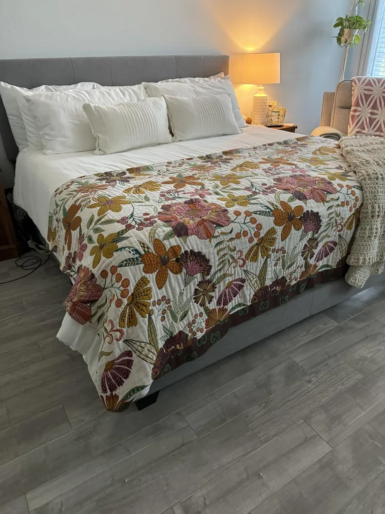
The goal is not to make every undertone identical. It is to notice what each shade is doing before you combine it. Compare paint, fabric, and decor samples directly with the flooring, upholstery, walls, and cabinets. Place similar shades beside one another, since a pink, green, or gold cast is easier to see through comparison. If the surrounding room is confusing your eye, put a plain white sheet of paper behind the samples. Warm and cool fall colors become much easier to sort once the background stops arguing.
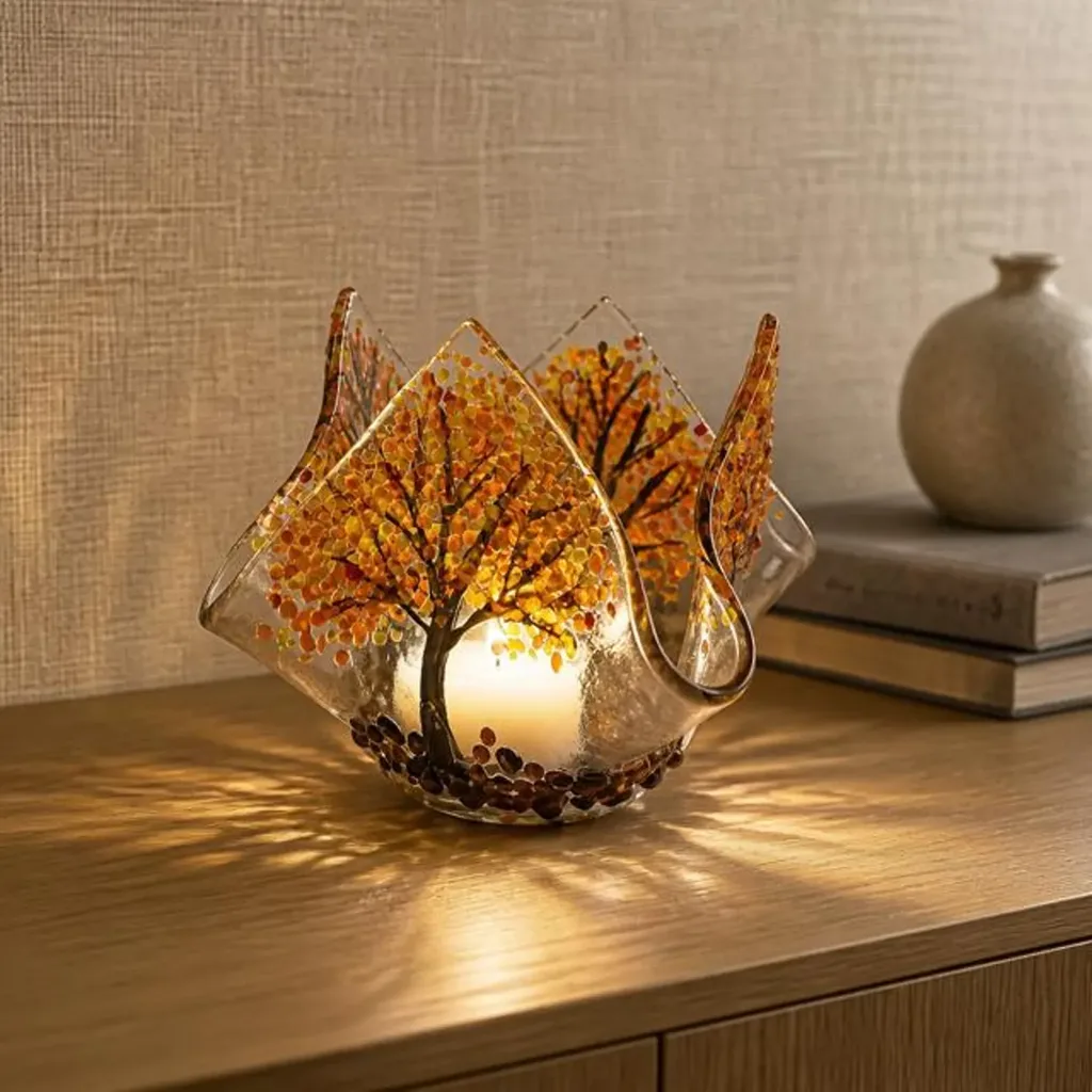
A yellow-based cream can sit comfortably beside caramel, rust, and warm wood. A pink-beige sofa may prefer burgundy, mauve, plum, or mushroom. The word beige does not settle the matter, which is why coordinating autumn colors by label alone can go sideways. Designer fall color combinations feel smoother when their undertones relate, balance one another on purpose, or repeat a hue that already appears in the room. That undertone check is what keeps designer fall color combinations from looking accidental.
Natural Light Changes How Fall Colors Look
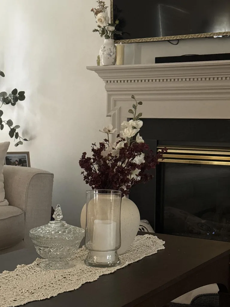
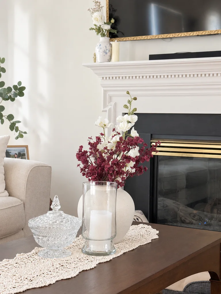
Sunlight can make the same sample look like four different relatives over the course of a day. North-facing rooms usually have cooler-looking light, while south-facing spaces tend to receive stronger, warmer light. East-facing rooms brighten and warm in the morning. West-facing rooms often begin cooler or muted, then become much warmer in late afternoon. Sherwin-Williams notes that a west-facing room can look dull in the morning and glow warmly later, and that artificial bulbs can strengthen either warm or cool parts of a palette.
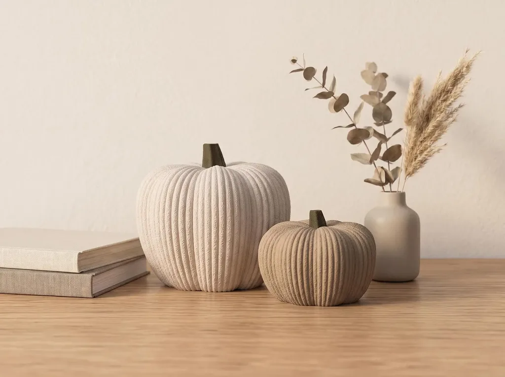
Houston’s bright sun can make saturated reds, oranges, and golds appear more intense, so choosing fall colors for natural light should include the hour when the room gets used most. Check fall paint colors near the breakfast table in the morning, but judge living-room accents again when everyone gathers in the evening. After sunset, warm bulbs may strengthen reds, browns, and golds, while cooler bulbs may bring blues and greens forward. Autumn colors for interiors need to pass both the sunshine test and the lamp test.
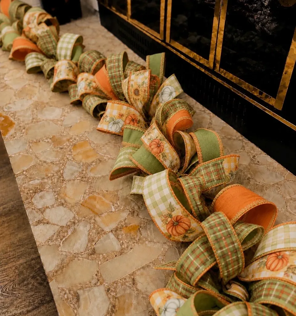
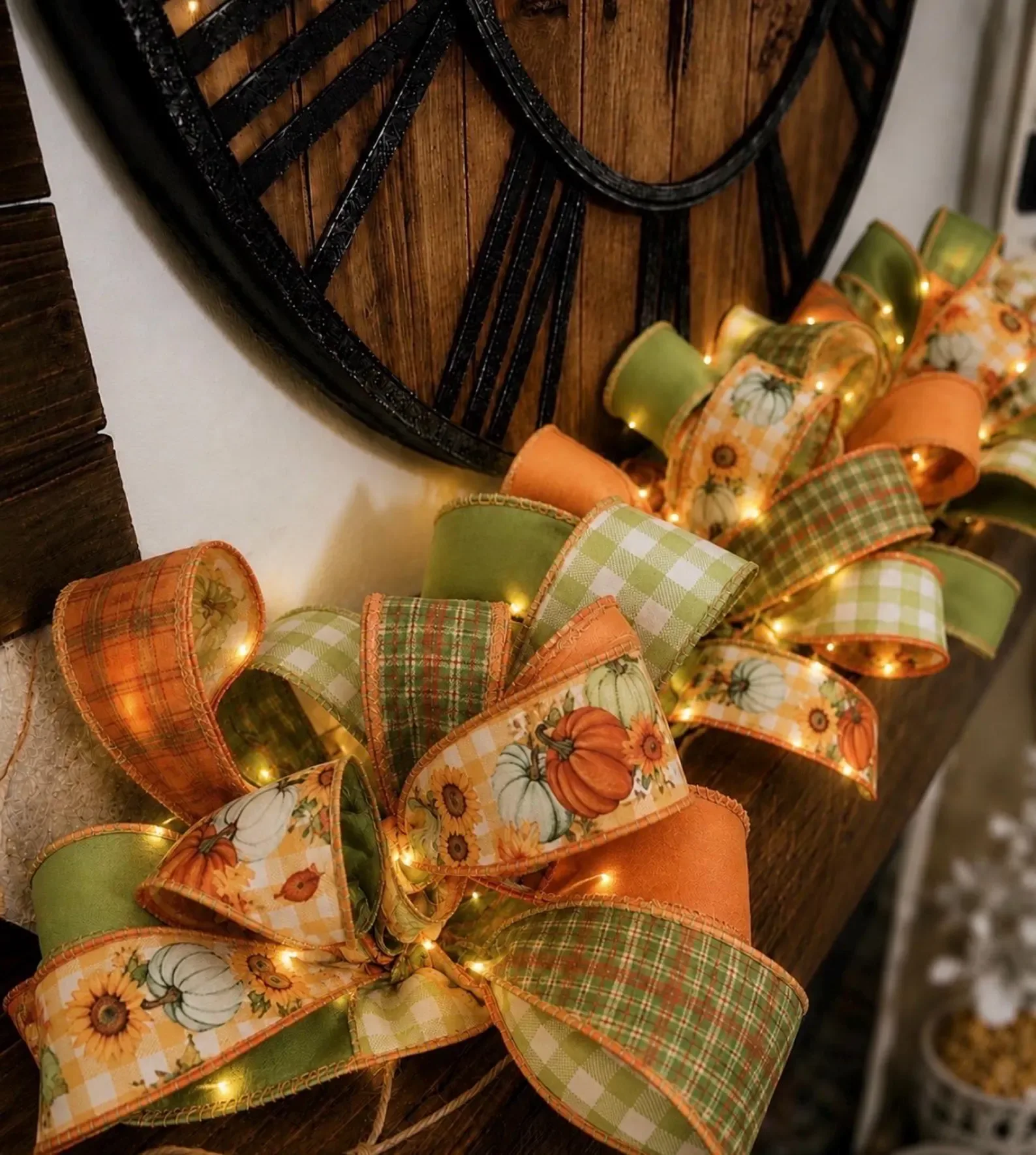
Place your possible colors near a window and photograph them in the morning, around midday, late afternoon, and after the lamps come on. A warm fall color palette that looks good in all four photographs is safer than one that behaves for twenty flattering minutes around lunch. The camera can also reveal a shade that suddenly looks too bright or dull. Color has moods, apparently, and west-facing burgundy can be especially dramatic by five o’clock.
Fall Color Palettes Beyond Orange and Yellow
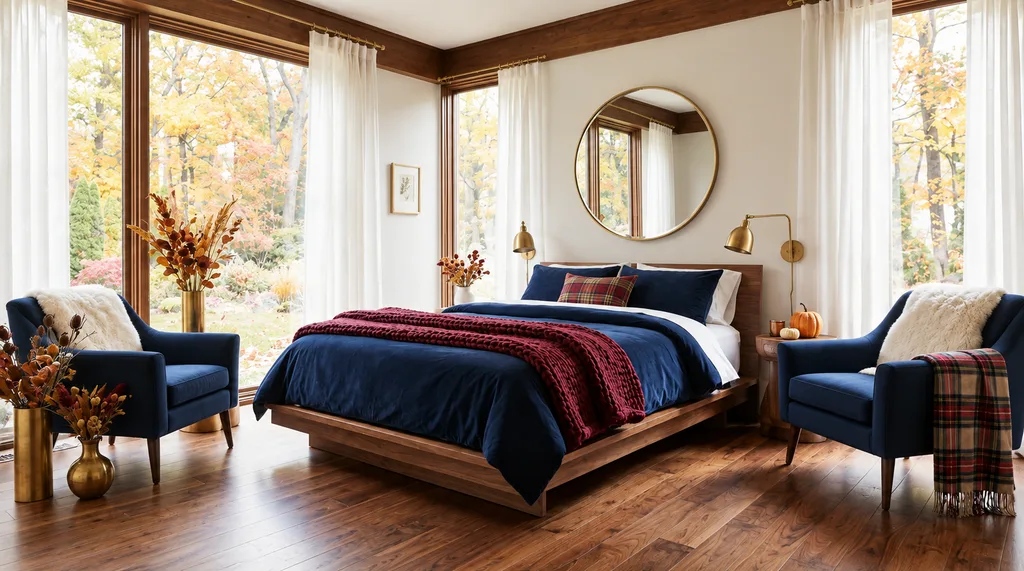
A room can feel autumnal through depth, warmth, natural references, and material, so orange and yellow are options rather than mandatory uniforms. Fall colors besides orange include olive, burgundy, plum, navy, deep teal, dusty rose, charcoal, chocolate, and oatmeal. A nontraditional fall color palette still reads as seasonal when the shades connect to foliage, wood, herbs, evening skies, aged metals, and heavier textiles.
| Alternative fall color | Colors that work with it | Where to use it |
| Olive or moss green | Cream, walnut, black, brass, burgundy | Pillows, table linens, glassware, foliage |
| Burgundy or oxblood | Camel, mushroom, dusty pink, deep green | Upholstery, artwork, candles, small accents |
| Plum or aubergine | Taupe, bronze, muted blue, warm gray | Throws, florals, napkins, accent chairs |
| Navy or inky blue | Cognac, copper, cream, olive | Rugs, pillows, ceramics, table settings |
| Chocolate brown | Ivory, dusty blue, rust, blush | Wood, leather, textiles, pottery |
| Deep teal | Walnut, burgundy, aged brass, tan | Glassware, curtains, pillows, painted furniture |
| Mauve or dusty rose | Cocoa brown, plum, cream, olive | Bedding, florals, candles, textiles |
| Charcoal | Camel, moss, copper, warm white | Frames, candleholders, pottery, small furniture |
| Warm cream and oatmeal | Nearly any deep autumn shade | Curtains, rugs, pillows, table linens |
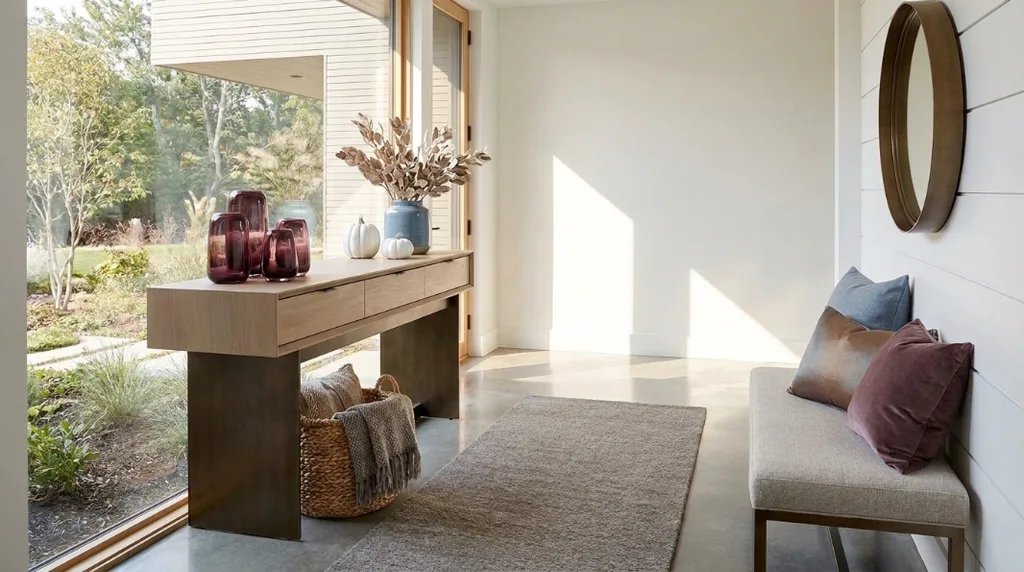
Green can reference late foliage, herbs, evergreens, and moss. Burgundy and plum add richness without repeating pumpkin orange, while navy and deep teal keep warm rooms from turning into one large bowl of brown. Dusty rose and mauve soften dark wood and strong burgundy accents. Chocolate, camel, mushroom, and oatmeal make an elegant autumn color palette with enough quiet space for one stronger shade.
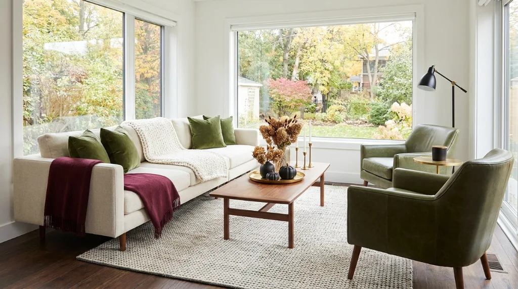
Choose one unexpected color and support it with two familiar neutrals. Try olive, burgundy, and warm cream; plum, mushroom, and antique brass; navy, cognac, and oatmeal; deep teal, walnut, and dusty rose; chocolate, muted blue, and ivory; or charcoal, camel, and moss. These unexpected fall color combinations and autumn home color schemes feel current without chasing a trend. Modern fall decorating colors work best when the surprise shade has company, not when it is stranded on one lonely candle.
Designers Give Every Fall Color a Specific Job
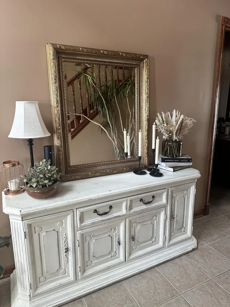
A balanced fall color palette becomes easier to build when every shade has a job. The dominant color occupies the most space, the supporting color repeats through medium-size elements, and the accent delivers the strongest contrast in smaller doses. Benjamin Moore’s whole-house guidance follows a similar structure, starting with a dominant color, adding secondary colors, and using contrasting accents in moderation.
| Color role | What it does | Common places to find it |
| Dominant color | Occupies most of the room and sets the visual background. | Walls, flooring, sofa, or large rug |
| Supporting color | Connects the dominant shade to the seasonal accents. | Curtains, chairs, throws, bedding, or medium-size decor |
| Accent color | Adds the strongest or most seasonal note in a controlled amount. | Pillows, artwork, books, candles, flowers, or small objects |
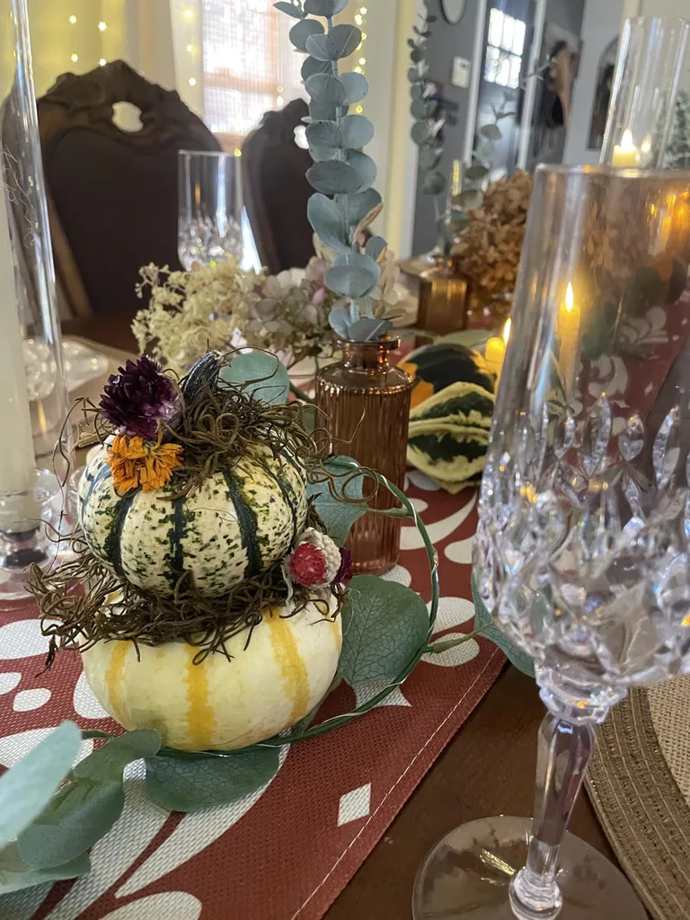
You do not need to repaint for fall. In a living room with cream walls and a brown sofa, cream can remain dominant, olive can support it through pillows and a throw, and burgundy can appear in flowers, books, and candles. The designer color combinations come from changing the smaller layers, not sending the household into a paint project because the calendar changed.
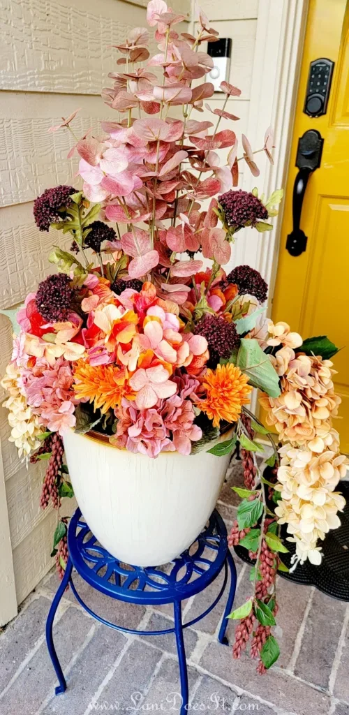
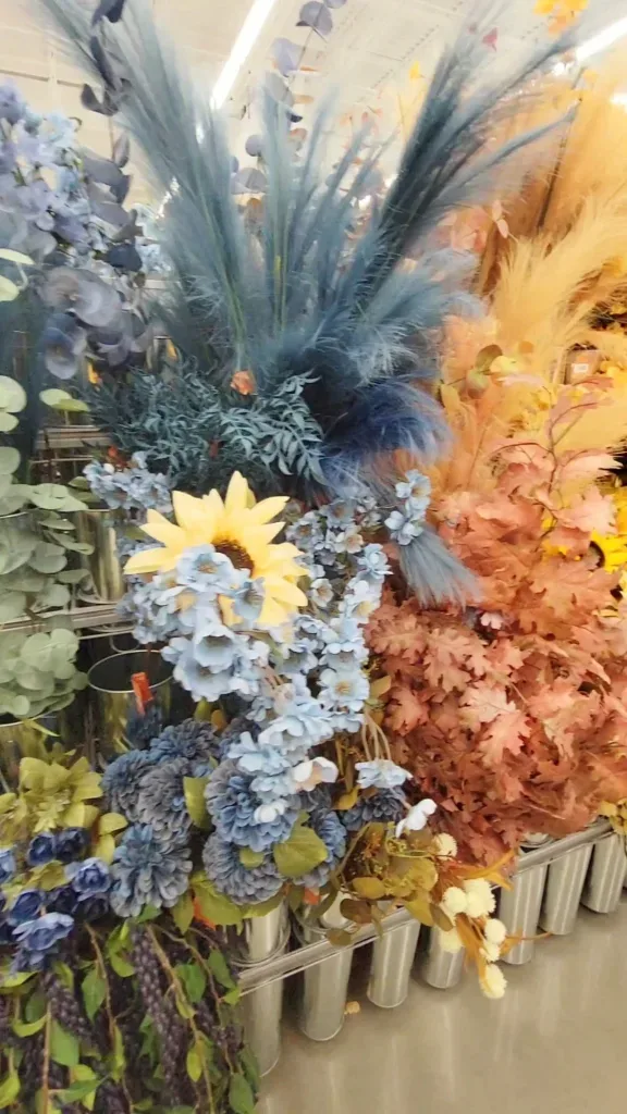
For a cooler home, soft gray can remain dominant, navy can support it, and plum or cognac can become the accent. These designer fall color combinations give fall accent colors enough presence to register without taking over. This framework also explains why a little orange may look better than an orange avalanche. Autumn living-room colors need proportion, and even a very enthusiastic pumpkin should understand boundaries.
Test Fall Colors Before Buying or Decorating
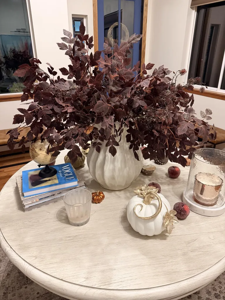
Physical samples tell the truth more reliably than a phone screen. Gather paint chips, pillow covers, fabric pieces, wood samples, and photographs of the room’s permanent finishes. Arrange them on a white board, tray, or sheet of paper to create a portable fall color palette, then move it beside the sofa, flooring, curtains, cabinets, and artwork. Testing autumn home color schemes this way is far more useful than judging separate items under store lights. Keep receipts and tags attached while the colors are still auditioning.
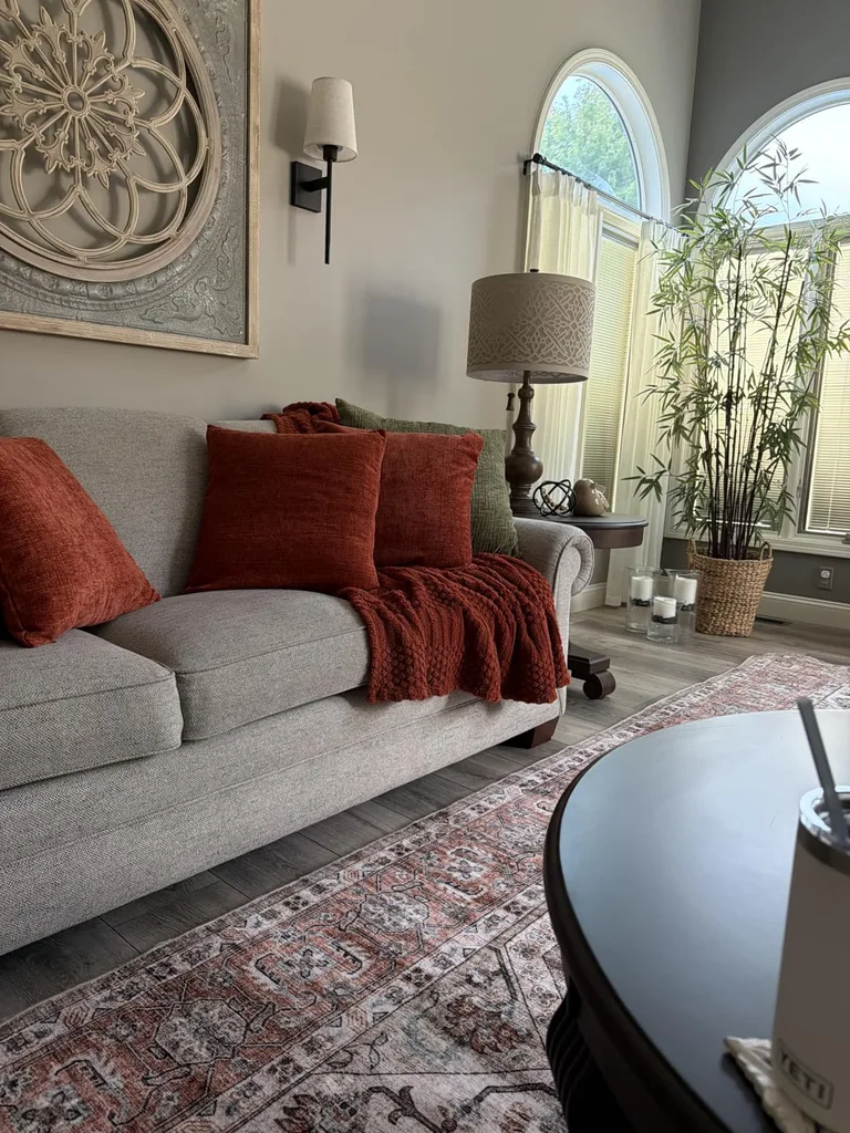
Leave the samples in place for at least one full day and check them under daylight and the lamps used at night. Photograph the arrangement to catch a color that looks disproportionately bright or dull. Benjamin Moore recommends larger movable samples on white foam board and observing them around the room from morning through evening under natural and artificial light. This final step in how to choose fall colors can prevent a deep teal pillow from becoming electric blue after sunset.
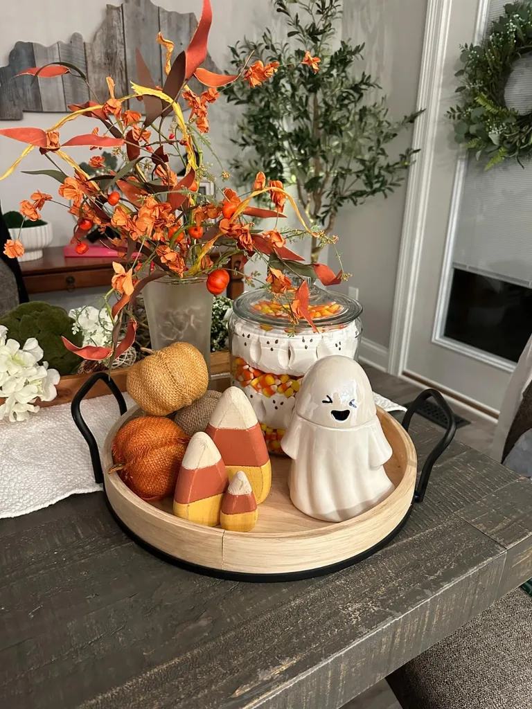
The checklist below keeps the room test practical. Use it for paint, textiles, pottery, artwork, or any other seasonal addition. Fall colors for home decor should cooperate with the expensive pieces, look good during the hours you live in the room, and leave enough contrast to keep the palette readable. If a color passes only in one corner at one hour, it has not passed. It has found a flattering angle.
Simple Designer-Inspired Color Checklist
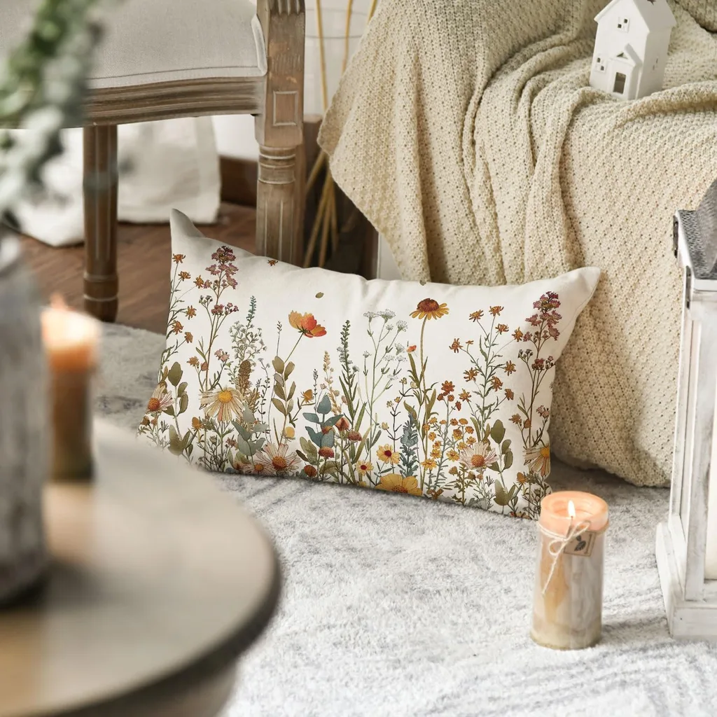
• Does this color coordinate with the floor?
• Does it work with the largest piece of furniture?
• What undertone becomes visible beside the walls?
• Does it still look good after dark?
• Which color is dominant?
• Which color supports it?
• Which color is the accent?
• Does the palette contain enough contrast?
• Is any shade taking over the room?
• Can at least one color remain after fall?
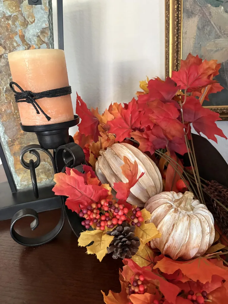
Answer the questions while the samples are still movable and returnable. A designer fall color combination should survive more than a quick glance in store lighting. If the floor, sofa, and walls all seem happy but one accent keeps shouting, reduce its amount or try a softer version.
Use your phone photographs to compare the palette at different times instead of trusting one memory of the room. The images can reveal that a navy disappears at night or that a burgundy is overpowering the rug. Fall decorating color ideas improve quickly when you can see the whole arrangement at once rather than judging each object by itself.
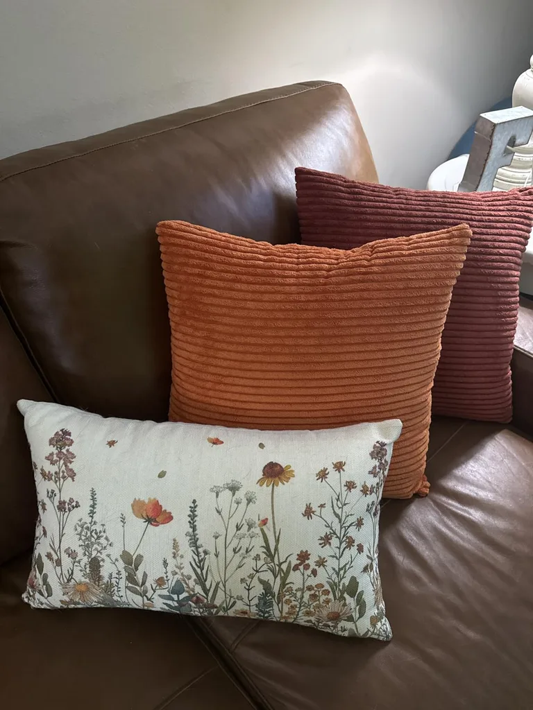
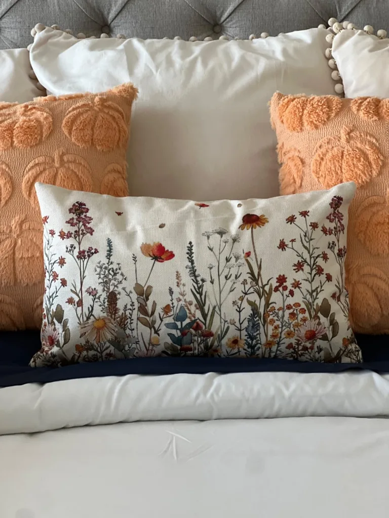
Once the palette passes the checklist, write down the colors and materials you used. That note can guide later purchases and keep coordinating fall colors consistent across the season. It also stops the familiar store-aisle moment when five lovely shades are in the cart and none of them know the sofa back home.
The Best Fall Colors Work With the Home
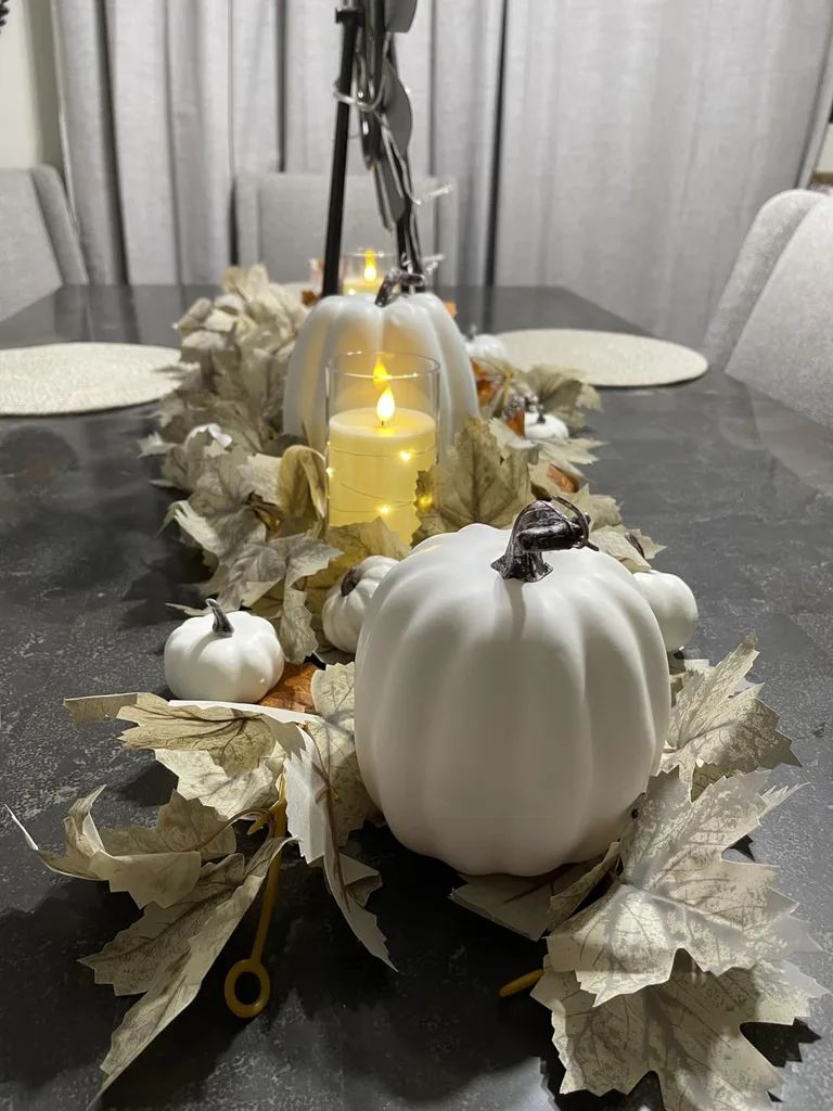
Successful fall colors are chosen in context, not copied from a seasonal display at the store. The strongest autumn home color schemes account for permanent finishes, fall color undertones, natural and artificial light, proportion, texture, and testing. That process explains how designers pick fall colors without relying on one supposedly perfect shade. The room itself provides most of the answer.
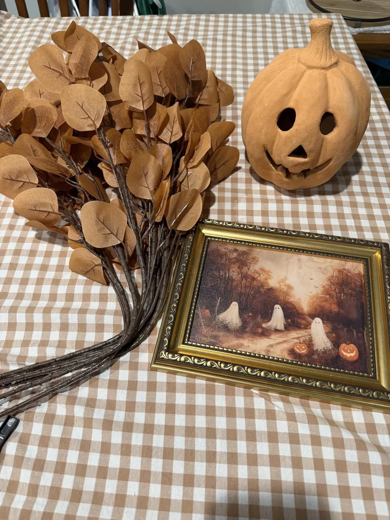
Orange and yellow are completely optional. Fall colors besides orange can feel just as seasonal when olive, plum, burgundy, navy, chocolate, teal, or mauve connects with the home’s existing palette. If you are exploring fall colors besides orange for the first time, begin with one color you already love and build outward through a supporting shade and a measured accent. A considered interior fall color palette looks festive while allowing the sofa, floor, and artwork to remain themselves.
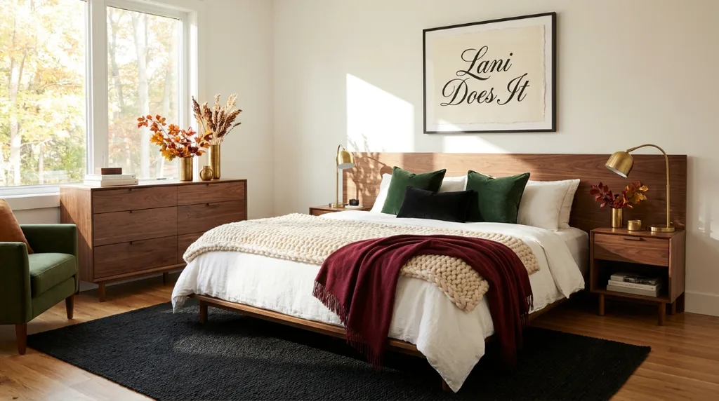
For more fall decorating color ideas, follow me on TikTok, Instagram, and Pinterest, and subscribe to my YouTube channel. You can also shop CuratedbyLani.com for affordable seasonal decor and everyday pieces that can stay after fall. Learning how to choose fall colors is mostly learning to notice what the room has been telling you all along. Give the palette a little depth, repeat it with intention, and let the house look seasonal without putting on a temporary costume, y’all!