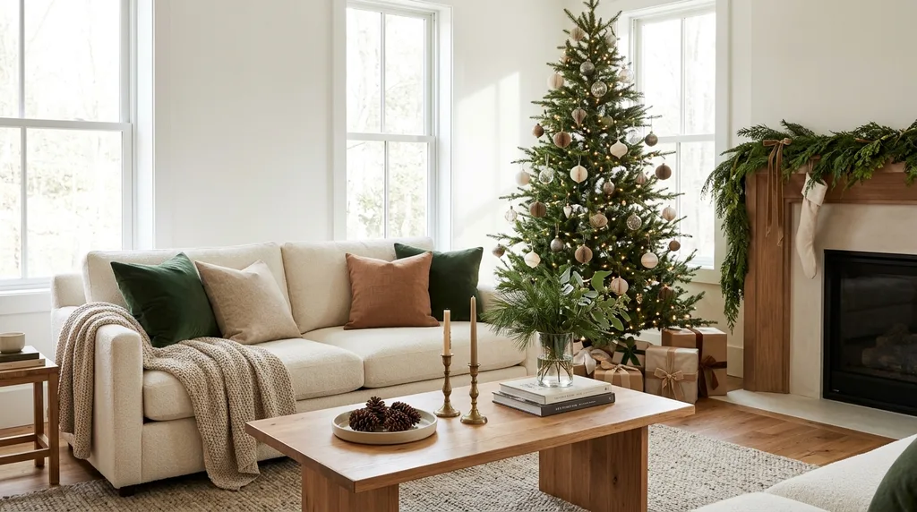
Christmas decorating is one of the few times of year when we can have a little fun with color. We can bring out the traditional reds and greens, try something unexpected, or mix treasured decorations with a few fresh accents to create a look that feels like home.
The Christmas Color Trends for 2026 offer plenty of inspiration. Rich burgundy, deep greens, jewel tones, warm metallics, nature-inspired shades, and even unexpected colors like powder blue and pink are finding their place in holiday decorating.
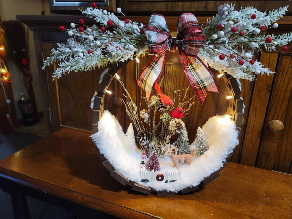
The best part? You don’t have to replace your Christmas decorations to enjoy a fresh look this year. A thoughtful combination of Christmas Decorating Colors can make familiar ornaments, ribbons, greenery, and accessories feel completely different.
Let’s explore seven beautiful Christmas Color Palettes worth considering in 2026, along with practical Christmas Decorating Ideas to help you bring each look into your home.
1. Burgundy, Deep Green, and Gold: A Rich Christmas Classic
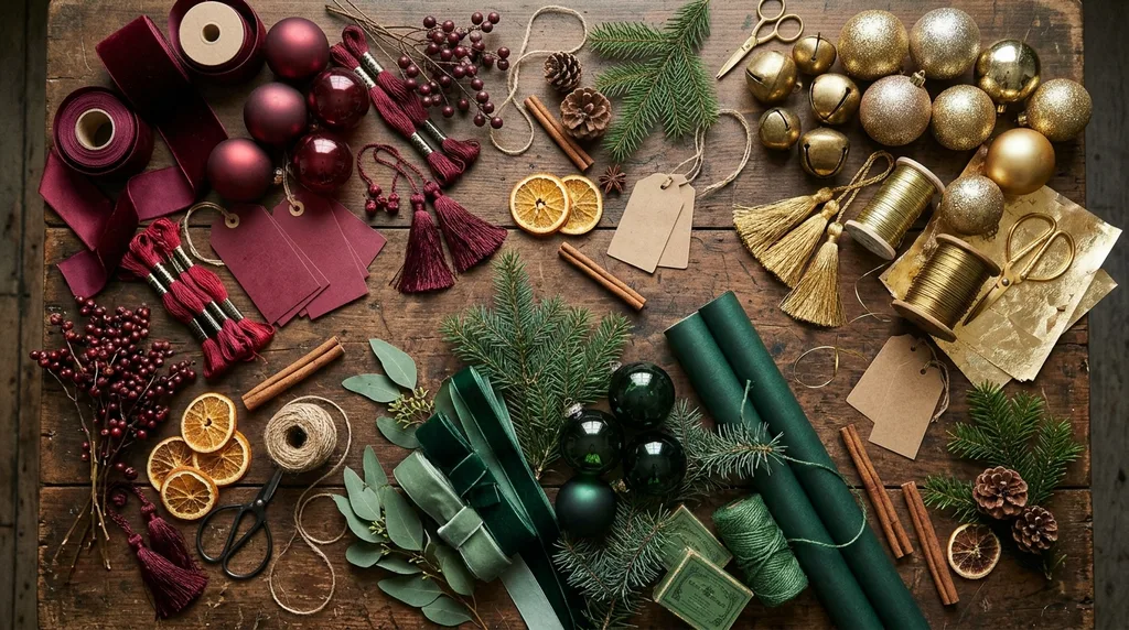
If you want a Christmas palette that feels elegant, warm, and timeless, start with burgundy, deep green, and gold.
Burgundy brings depth and richness. Deep green connects the palette to traditional Christmas greenery, while gold adds warmth and a little festive sparkle.
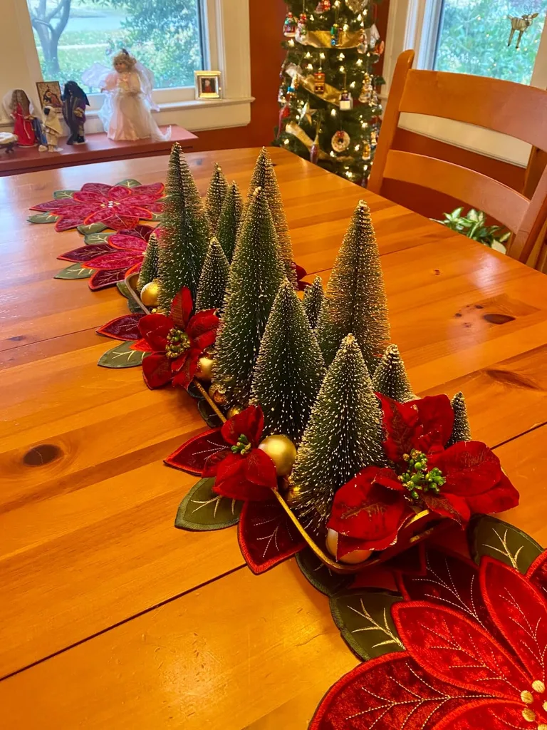
This combination is a beautiful way to enjoy classic Christmas Decorating Colors while creating a look that feels a little more dramatic than bright red and green.
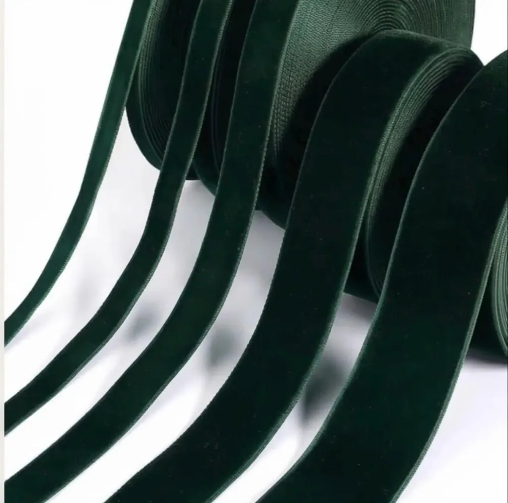
How to use this palette:
- Start with your existing evergreen garland or Christmas tree.
- Add burgundy ornaments, ribbon, or decorative picks.
- Use gold as an accent through ornaments, candleholders, bells, or picture frames.
- Include a few clear glass decorations to keep the arrangement from feeling too heavy.
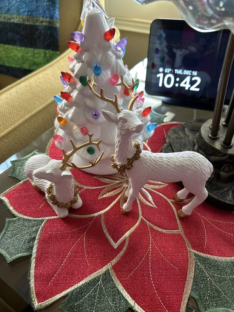
You don’t need equal amounts of all three colors. Let green provide the foundation, burgundy create the contrast, and gold finish the look.
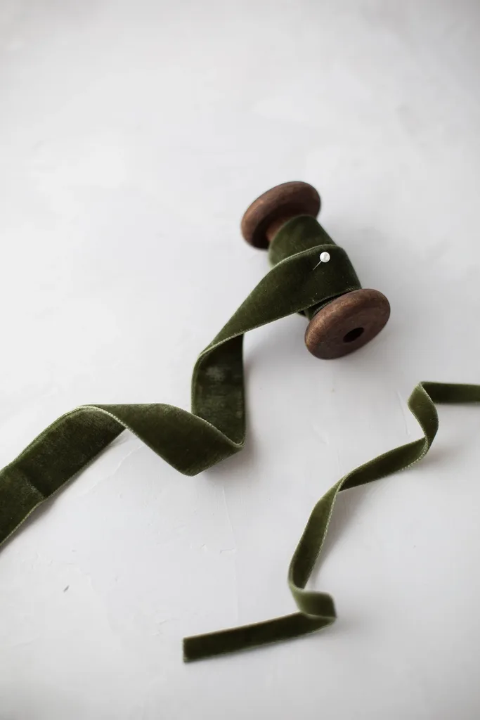
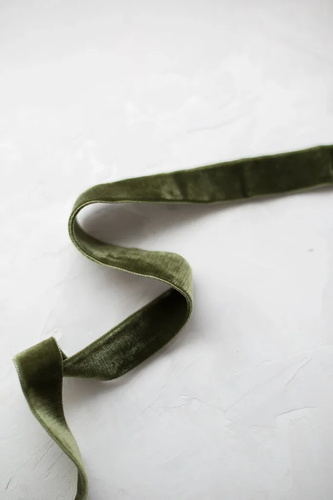
A decorating idea: Try burgundy ribbon on a green wreath, then repeat a small amount of burgundy in the room through a throw pillow or tabletop accessory. Repeating a color in more than one place helps the decorations feel connected.
2. Traditional Red and Green: Familiar, but More Layered
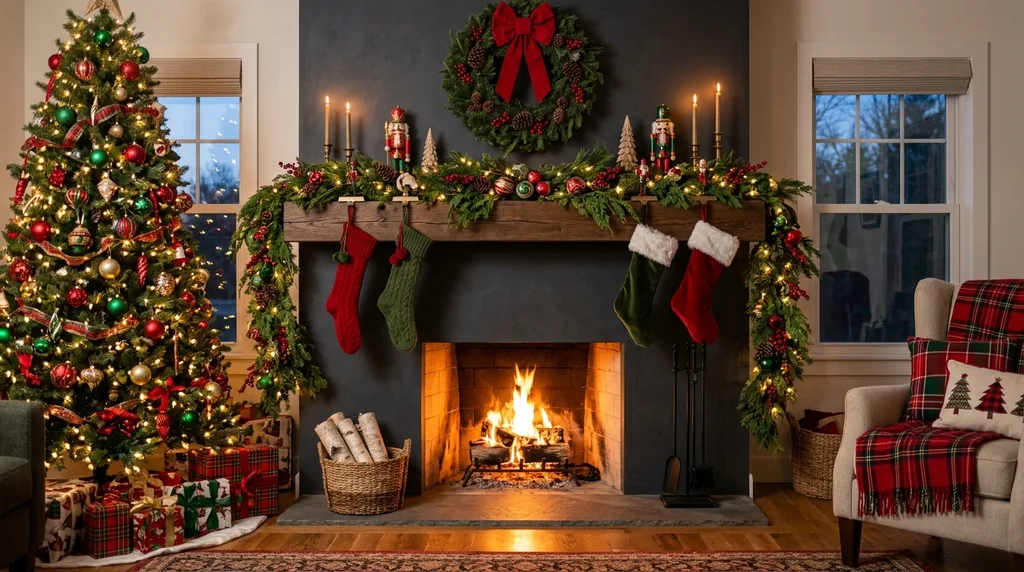
Red and green are not going anywhere. Traditional Christmas colors can still feel fresh when you pay attention to the shades, textures, and finishes you combine.
Instead of using only bright red and shiny green ornaments, consider mixing deeper reds, forest greens, antique gold, natural wood, and soft white.
This approach gives familiar Christmas Decorating Ideas more dimension. It can also help older decorations feel intentional rather than outdated.
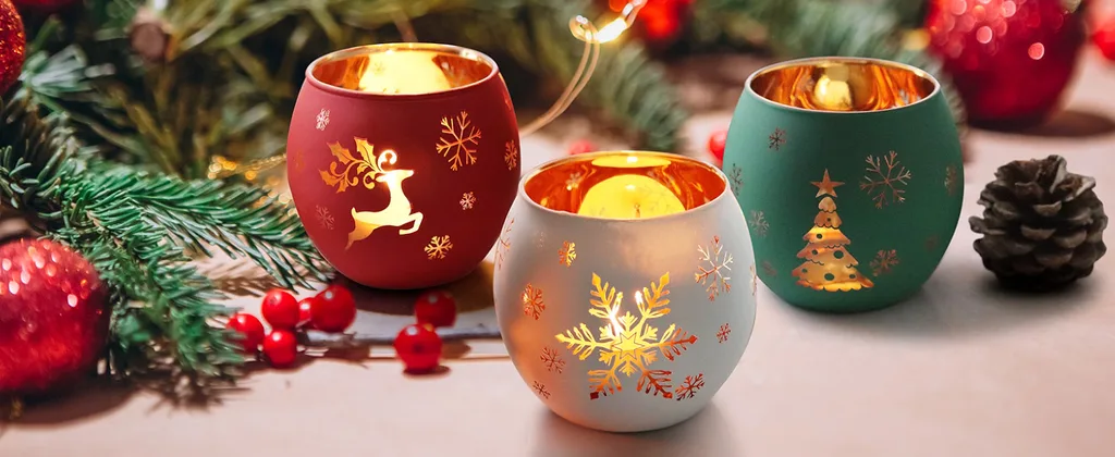
How to use this palette:
- Combine different shades of red instead of relying on one exact tone.
- Mix glossy ornaments with matte, textured, or fabric finishes.
- Add natural greenery, pinecones, or wooden decorations.
- Use warm white lights to soften the overall arrangement.
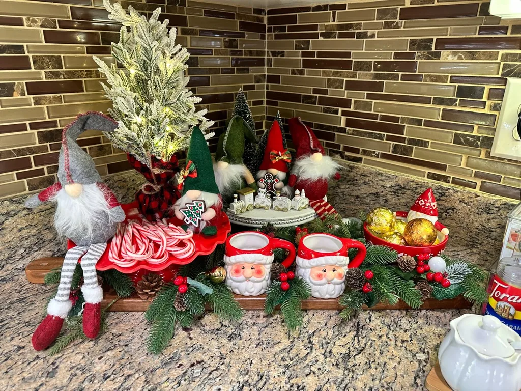
The secret is variety. When every ornament has the same finish and intensity, the display can look flat. Different materials and finishes create visual interest without requiring more decorations.
A decorating idea: Gather your red ornaments and sort them by shade and finish. Group a few deeper reds together, then add green and natural accents. You may be surprised by how much you can do with what you already have.
3. Jewel Tones: Emerald, Plum, and Deep Berry
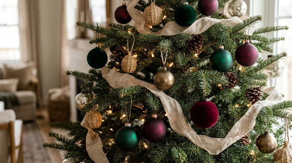
Jewel tones are a beautiful choice if you enjoy a more dramatic Christmas display.
Think emerald green, plum, ruby, and deep berry shades. These colors have visual depth and can make a tree, mantel, or holiday table feel rich and collected.
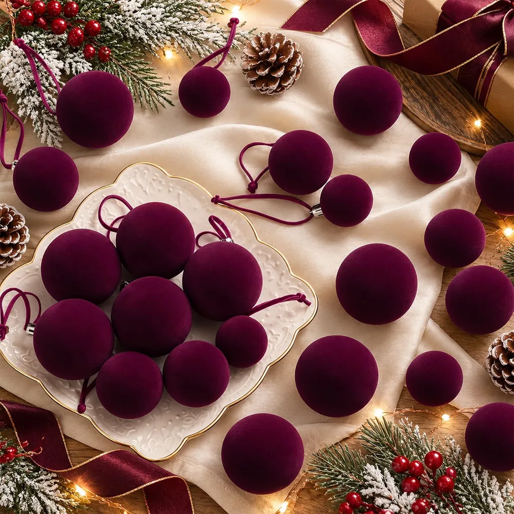
Among the Christmas Color Trends worth exploring, jewel tones are especially appealing because they offer a way to create a more layered look without relying on an entirely new collection of decorations.
The key is to give these colors room to stand out. Too many equally strong shades can compete with one another, so choose one or two leading colors and let the others support them.
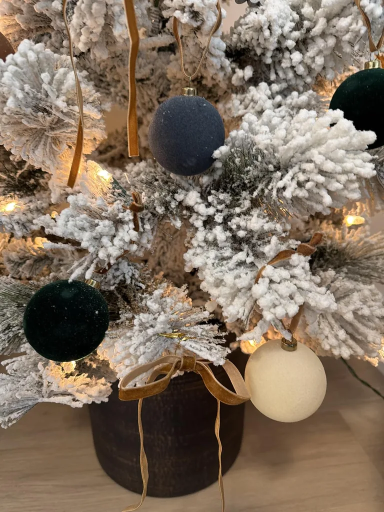
How to use this palette:
- Choose emerald as your main color and add plum or berry ornaments.
- Use velvet ribbon or fabric accents to introduce a softer texture.
- Add glass or metallic decorations to catch the light.
- Keep some greenery or neutral space visible so the colors do not overwhelm the arrangement.
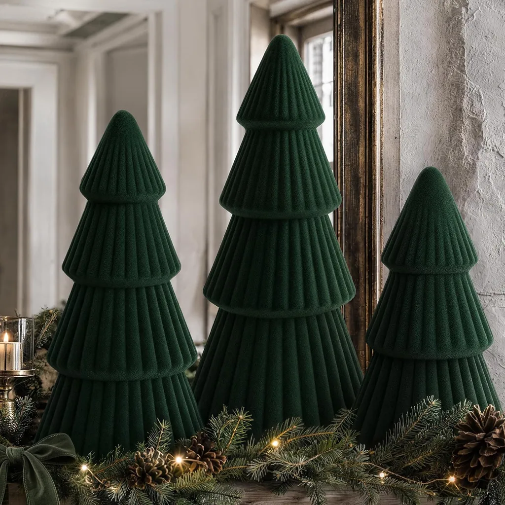
Jewel tones work particularly well when you want your Christmas decorations to feel a little more formal or dramatic.
A decorating idea: If you already own green ornaments, try adding just a few plum or berry-colored accents. You can change the mood of your tree without purchasing a completely new set.
4. Champagne, Ivory, and Warm Gold: Soft Holiday Elegance
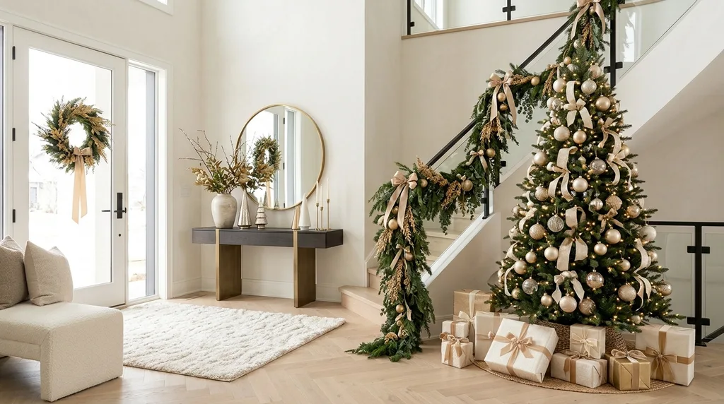
Not every Christmas color scheme needs strong contrast. Champagne, ivory, cream, and warm gold create a softer holiday look that feels calm and welcoming.
This palette is especially useful when you want your decorations to complement a room with warm wood, neutral fabrics, or lighter furniture.
The trick is to use differences in texture and finish so the colors do not blend into one another.
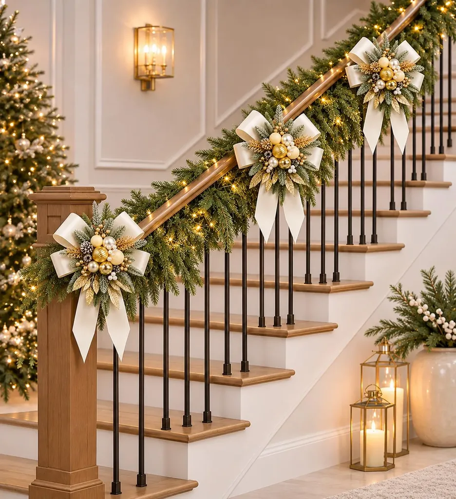
How to use this palette:
- Use ivory or cream as the light foundation.
- Add champagne-colored ornaments for subtle warmth.
- Bring in gold through a few carefully placed accents.
- Mix glass, linen, velvet, wood, and metallic finishes.
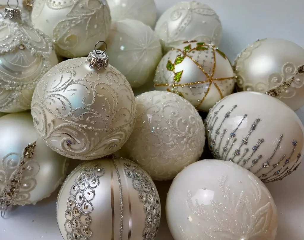
A combination of matte and reflective surfaces gives this palette dimension. For example, a matte ivory ornament looks lovely beside a champagne glass bauble or a brushed gold decoration.
A decorating idea: Style a small bowl or tray with cream ornaments, a few gold accents, and natural greenery. It is an easy way to try this palette without changing your entire Christmas tree.
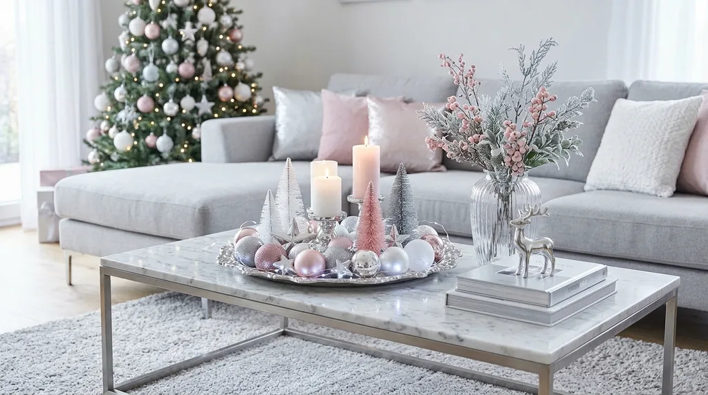
5. Silver, Powder Blue, and Cool White: A Fresh Winter Look
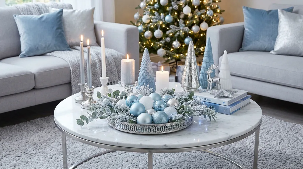
For something different from the usual warm Christmas colors, consider silver, powder blue, and cool white.
This combination creates a crisp winter-inspired look. Powder blue adds softness, while silver and white bring brightness and reflect light.
It is a lovely option for a home that already uses cooler colors or for anyone who enjoys a lighter, more contemporary holiday style.

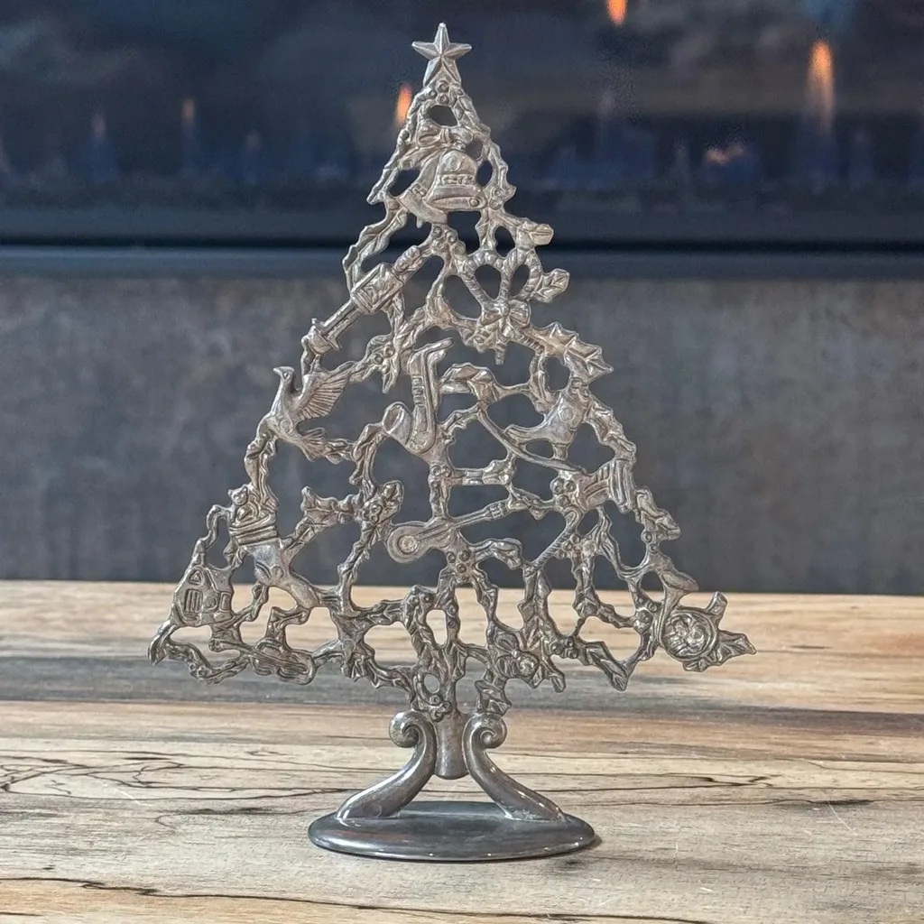
How to use this palette:
- Begin with white or silver decorations.
- Introduce powder blue through ornaments, ribbon, or small accessories.
- Add clear glass pieces to create lightness.
- Use greenery sparingly if you want to maintain a cooler overall appearance.
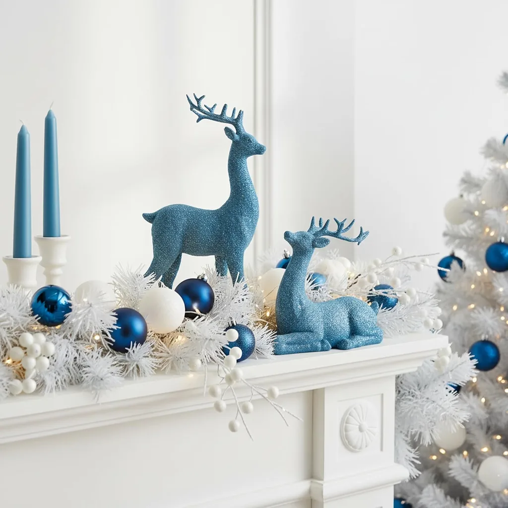
You can also pair powder blue with traditional red for a more unexpected color combination. The contrast makes the blue feel playful while the red keeps the display connected to Christmas.
A decorating idea: Try a small arrangement of silver and blue ornaments in a clear glass bowl. Add a few branches of greenery if the display needs a natural touch.
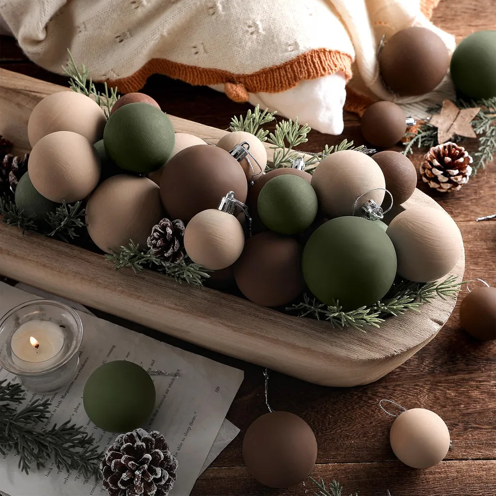
6. Nature-Inspired Greens, Browns, and Soft Earthy Shades
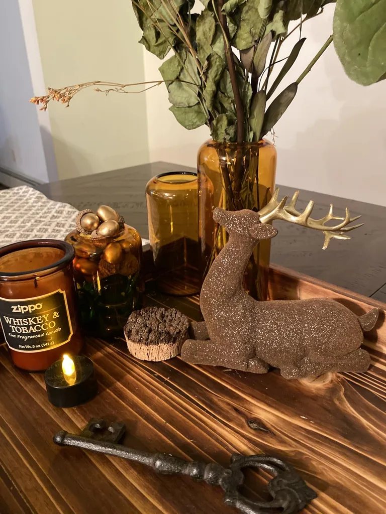
If you prefer a relaxed, natural Christmas, look toward moss green, olive, warm brown, soft clay, and other earthy shades.
This palette draws inspiration from the outdoors. It feels especially at home with natural greenery, wooden decorations, woven materials, and simple handmade details.
Rather than relying on lots of sparkle, the interest comes from the materials and their natural variations.
These Christmas Decorating Colors are also easy to adapt to decorations you may already own. Natural wood, greenery, and neutral accessories can become the foundation for a fresh holiday arrangement.
How to use this palette:
- Use evergreen or moss green as your foundation.
- Add brown through wooden ornaments, woven decorations, or natural accessories.
- Introduce soft clay or warm neutral accents.
- Mix in pinecones, dried botanicals, and natural-looking greenery.
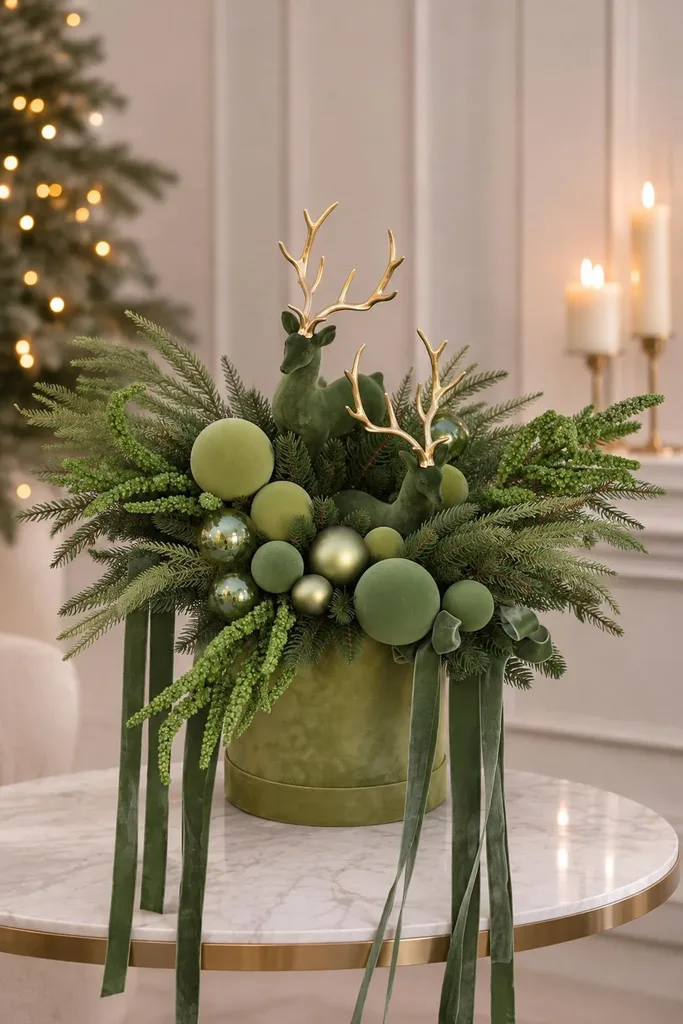
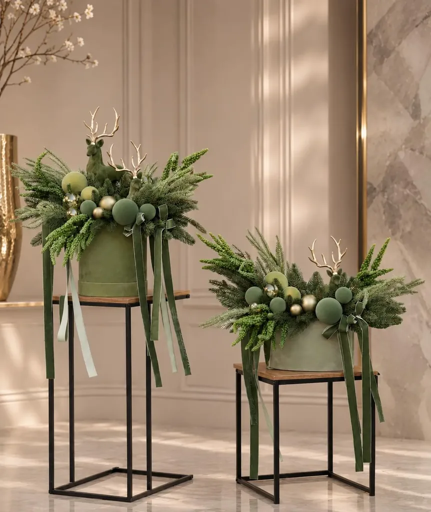
This look does not have to feel rustic. A few carefully selected glass or metallic pieces can give the arrangement a more polished finish.
A decorating idea: Combine a simple evergreen arrangement with wooden ornaments and a neutral ribbon. Let the natural textures do most of the decorating.
7. Playful Pink, Periwinkle, and Golden Yellow
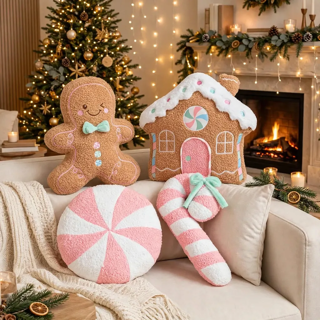
Christmas decorating can be joyful and unexpected, too. If you love color, consider a playful palette that includes pink, periwinkle, and golden yellow.
These shades bring a cheerful personality to holiday decorating. They are a departure from traditional red and green, but they can still feel festive when used with a little intention.
The best way to approach this palette is to choose one leading color and use the others as accents.
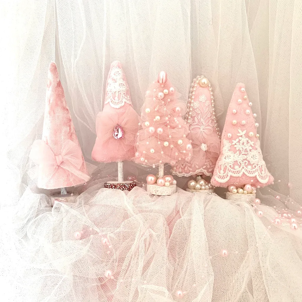
How to use this palette:
- Choose pink or periwinkle as your main color.
- Add golden yellow through ribbon, ornaments, or small decorative details.
- Use white or clear glass to give the colors breathing room.
- Repeat one accent color in another part of the room to create a connection.
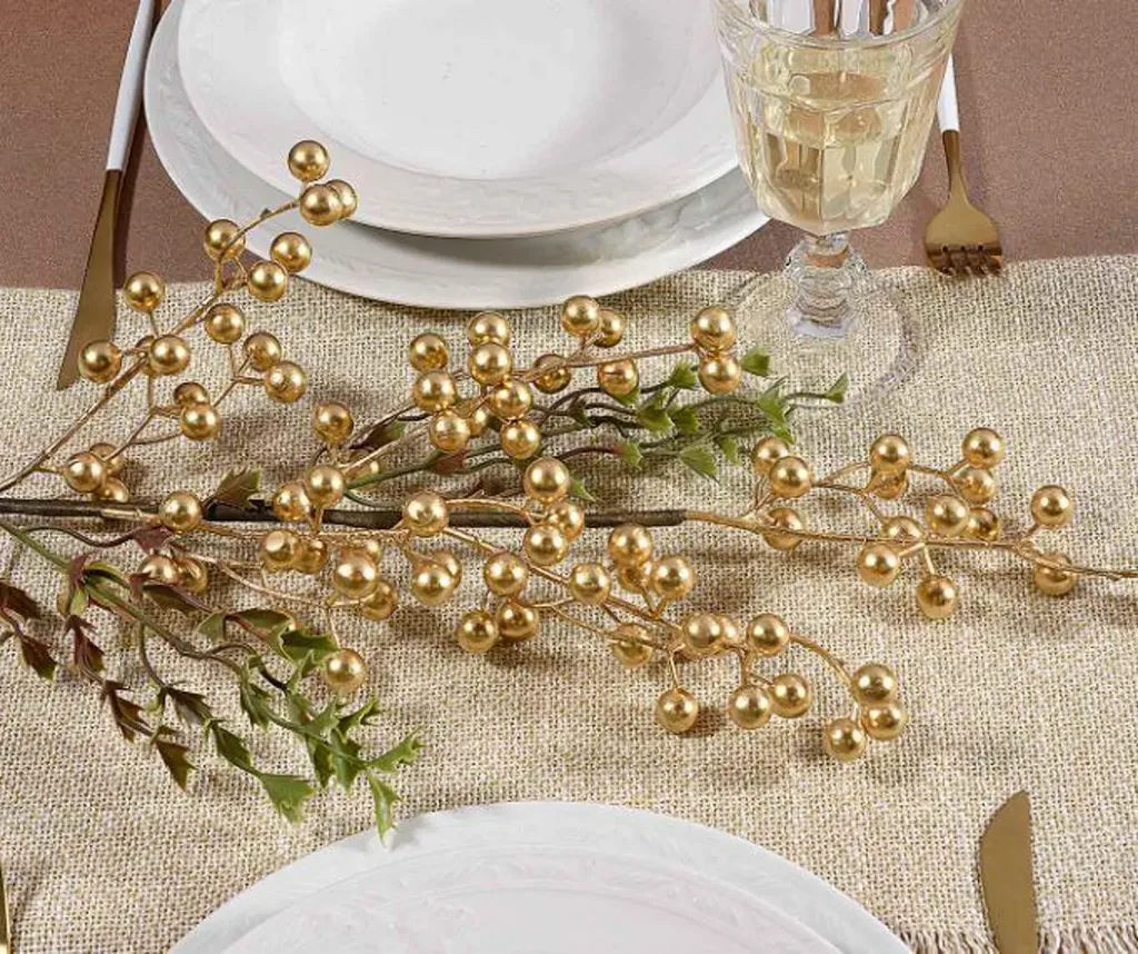
You can make this look as subtle or as colorful as you like. A few pink ornaments mixed with traditional greenery may be all you need.
A decorating idea: Try a small tabletop tree with pink ornaments and a few gold accents. It is a simple way to introduce a new color story without committing your entire home to it.
How to Choose the Right Christmas Color Palette for Your Home
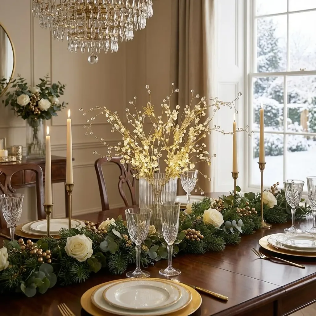
With so many beautiful Christmas Color Palettes to consider, it can be tempting to try several at once. But a successful decorating scheme starts with choosing colors that work with your home and the decorations you already own.
Here is a simple way to decide.
Start with the colors already in your room
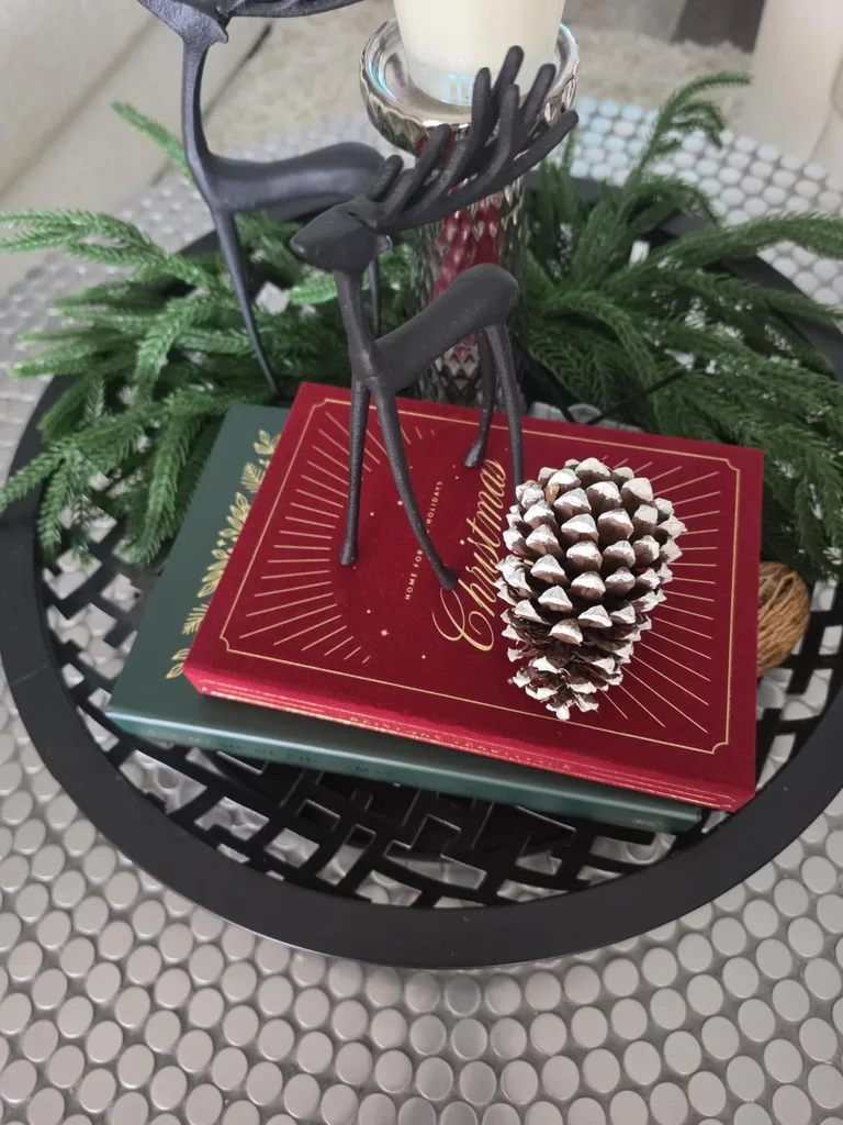
Look at your furniture, curtains, rugs, wall color, and larger accessories. These are the colors your Christmas decorations will need to live alongside.
If your room has warm wood and cream fabrics, champagne, burgundy, and earthy greens may feel natural. If your space includes cooler gray or blue tones, silver, powder blue, and white might be a better fit.
Choose one main color and two supporting colors
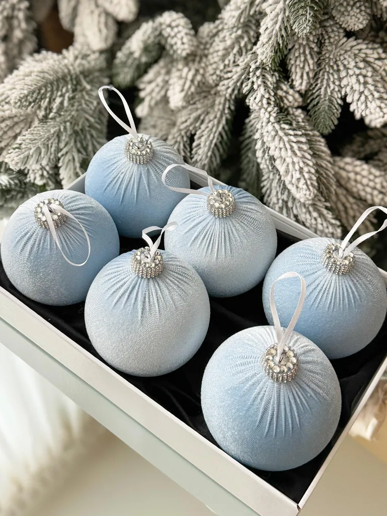
A simple three-color plan can help keep your decorations coordinated.
For example:
- Burgundy as the main color, deep green as the supporting color, and gold as the accent.
- Emerald as the main color, plum as the supporting color, and warm ivory as the accent.
- Powder blue as the main color, silver as the supporting color, and white as the accent.
You can use more colors, but having a clear starting point makes it easier to decide what belongs in the arrangement.
Consider texture and finish

Color is only part of the picture. The finish of each decoration affects how the colors look together.
A shiny gold ornament reflects light differently from a matte gold one. Velvet ribbon creates a softer appearance than metallic ribbon. Clear glass can add brightness without introducing another strong color.
Mixing finishes helps your decorations feel layered and thoughtfully arranged. This is one of the simplest Christmas Decorating Ideas to use when you want a display to feel more finished without adding more ornaments.
Shop your own Christmas decorations first
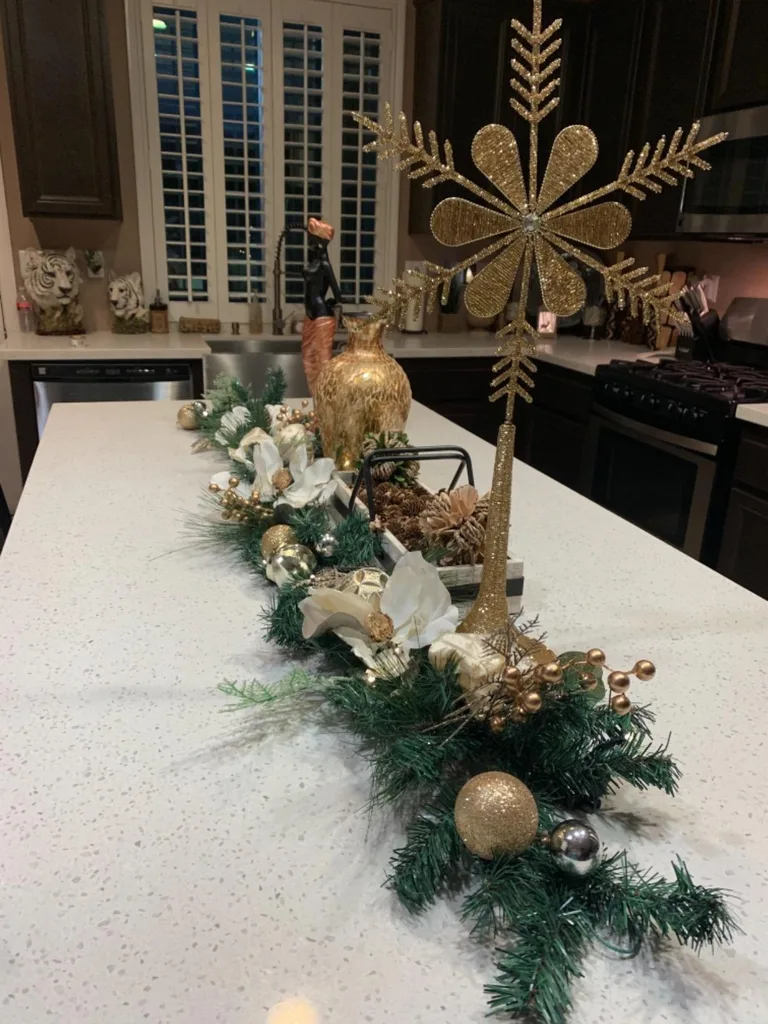
Before buying anything new, bring out the decorations you already have and sort them by color.
You may find that you have enough pieces to create a fresh palette with only a few small additions. An older ornament can look completely different when paired with a new ribbon or placed beside a contrasting color.
This is also a good way to avoid unnecessary spending and make use of decorations that still have meaning to you.
Lani’s Designer Tip: Let One Color Lead the Way
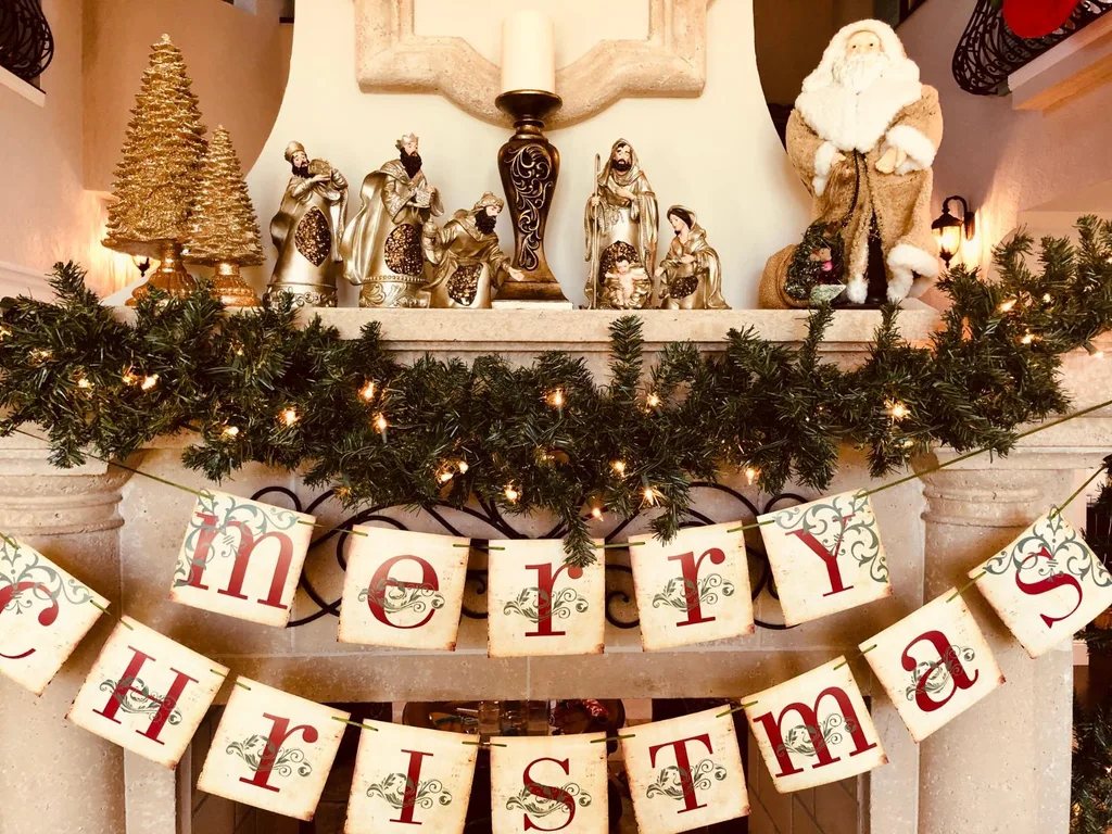
A Christmas display feels more balanced when one color establishes the overall look and the other colors support it. This creates a visual starting point for the eye, while contrast and varied finishes keep the arrangement interesting. You do not need every color to have equal attention.
Try this at home: Choose your favorite color from your existing Christmas decorations. Make it the leading color, then select two supporting colors from ornaments, ribbon, greenery, or accessories you already own. Arrange a small grouping first and adjust it before decorating the entire room.
So, Which Christmas Colors Will You Try in 2026?
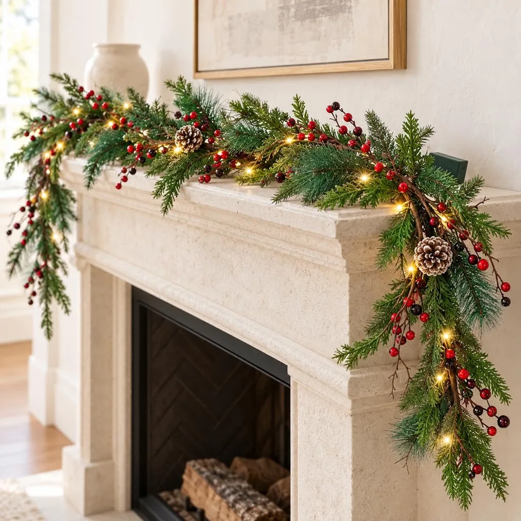
The best Christmas color trend is the one that makes your home feel welcoming and reflects the way you enjoy celebrating.
Maybe that means burgundy and gold, a soft champagne palette, or a playful combination of pink and periwinkle. You might even decide that your traditional red and green decorations are exactly what you want to bring out again this year.
The Christmas Color Trends for 2026 can give us fresh ideas, but they do not have to dictate every decorating decision. Choose the Christmas Decorating Colors you love, work with what you already own, and create a holiday look that feels like yours.
A Thought to Style By
A beautiful home does not need to follow every new trend to feel special. Sometimes the most meaningful change comes from seeing the familiar things you already love in a fresh way.

Come see what’s possible, and feel free to make it your own. Explore more seasonal decorating inspiration and practical home ideas at LaniDoesIt.com.
For more decorating inspiration, easy DIY projects, and seasonal ideas, follow me on Instagram, TikTok, and Pinterest. You can also subscribe to my YouTube channel for more home decor videos and creative projects.
And if you’re looking for affordable pieces to refresh your space, visit CuratedbyLani.com to shop holiday and non-holiday decor for every season.